BBC Corporate Arms
New, it's not
Quality: ST
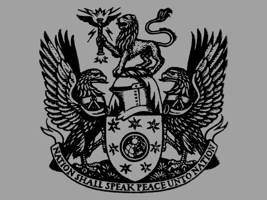
The BBC’s first Royal Charter came into force in 1927. Shortly afterwards the corporation was granted its own Armorial Bearings by the College of Arms. The colour version of the Coat of Arms incorporates the three colours of the BBC’s national regions: Blue for Scotland, red for Wales and green for Northern Ireland. The British lion which forms the ‘crest’ of the coat of arms holds a thunderbolt with lightning flashes – a heraldic way of representing broadcasting. The eagles (‘supporters’) on either side of the crest represent speed. They have bugles around their necks to symbolise public proclamation. The globe on an azure shield (the ether) has seven other planets in the sky around it, to reflect the scope and breadth of the corporation. Pluto hadn’t been discovered when the arms were completed. The motto is based on verses from the Book of Micah (chapter 4, verse 3) and the Book of Isaiah (chapter 2, verse 4). The original description of the crest says that the lion is also poised on ‘a wreath of the colours’.
New, it's not
Quality: ST
New, it's not
Quality: HQ
Examples of the BBC coat of arms in print and on buildings.


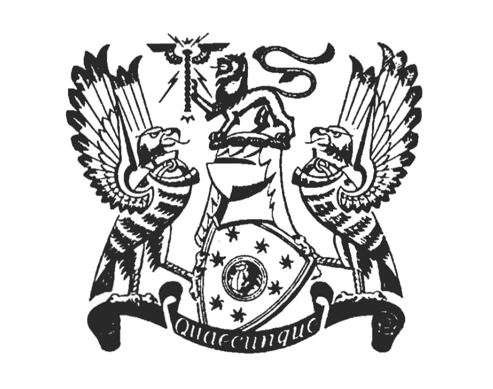

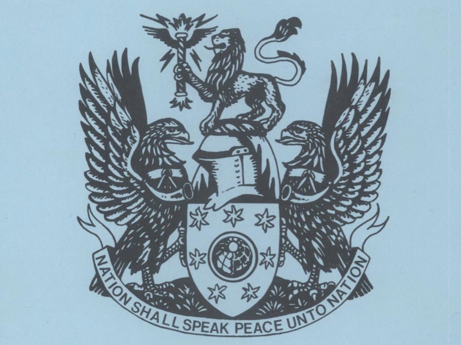


The BBC Coat of Arms was updated in 1988 with the introduction of the new slanted BBC logo designed by Michael Peters. The whole of the Arms properties remain the same, but appear more stylised and defined.
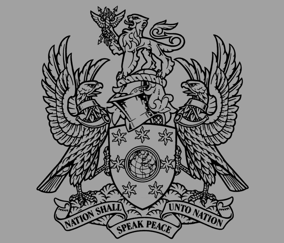
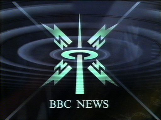
Examples of the BBC Coat of Arms in print and on-screen. BBC News adopted the crest in 1993 using a virtual coat of arms in the opening title sequence.


