BBC1 Colour Ident
New, it's not
Quality: HQ
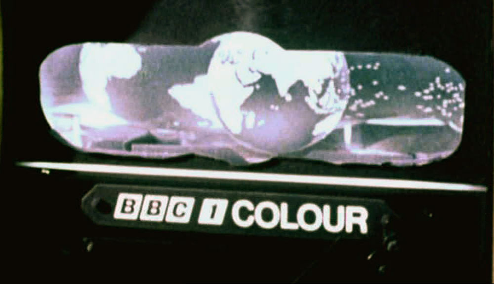
On the cusp of midnight, Saturday November 15 1969, BBC1 burst into a new era of colour broadcasting. This transition heralded the arrival of a television icon: the renowned mirror globe. This emblematic design was the creative brainchild of Murray Andrew, who meticulously crafted several prototypes before arriving at the iconic rendition. For over a decade and a half, Murray’s globe held a commanding presence on the channel, albeit with sporadic updates in colour schemes and design nuances.
New, it's not
Quality: HQ
New, it's not
Quality: HQ
New, it's not
Quality: HQ
New, it's not
Quality: ST
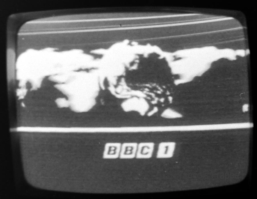
Three years later, in 1972, the BBC logo underwent a refined transformation. The design was streamlined with rounded edges, and the word “COLOUR” was rendered in italics, featuring a contemporary new typeface.
New, it's not
Quality: HQ
New, it's not
Quality: HQ
New, it's not
Quality: HQ
New, it's not
Quality: ST
New, it's not
Quality: HQ
New, it's not
Quality: HQ
New, it's not
Quality: HQ
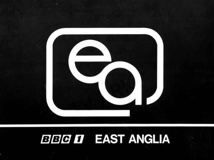
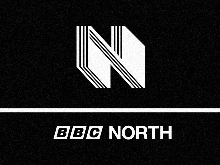
During this era, regional idents became a stylistic hallmark, particularly as symbolic imagery gained prominence into the 1970s. Could you assist us in uncovering the visual identities of other BBC regions? For instance, do you know what BBC West’s design looked like at the time?

New, it's not Quality: ST New, it's not Quality: ST New, it's not Quality: ST New, it's not Quality: STMoon Landing promo
Tuesday’s Documentary promo
New Season promo
Saturday promo
New, it's not Quality: HQ New, it's not Quality: STThe Morecambe and Wise Show
BBC1 Election Link
The ingeniously engineered “mirror globe” was born out of filming a luminous mechanical model in black and white, set against a concave mirror backdrop. This unique setup yielded a visually striking, elongated world that appeared to envelop the globe, lending the device its distinctive and memorable aesthetic.