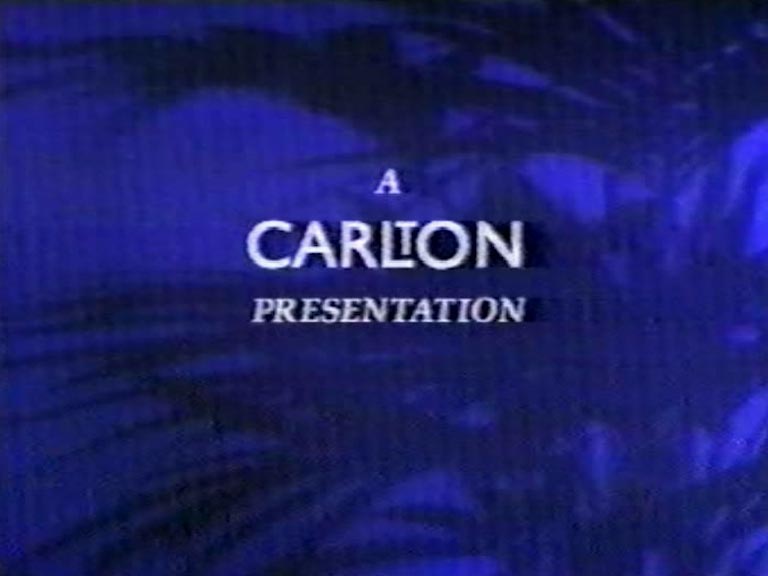
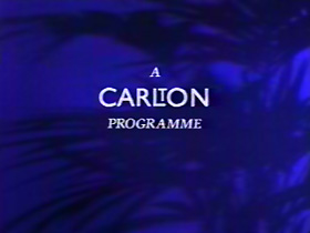
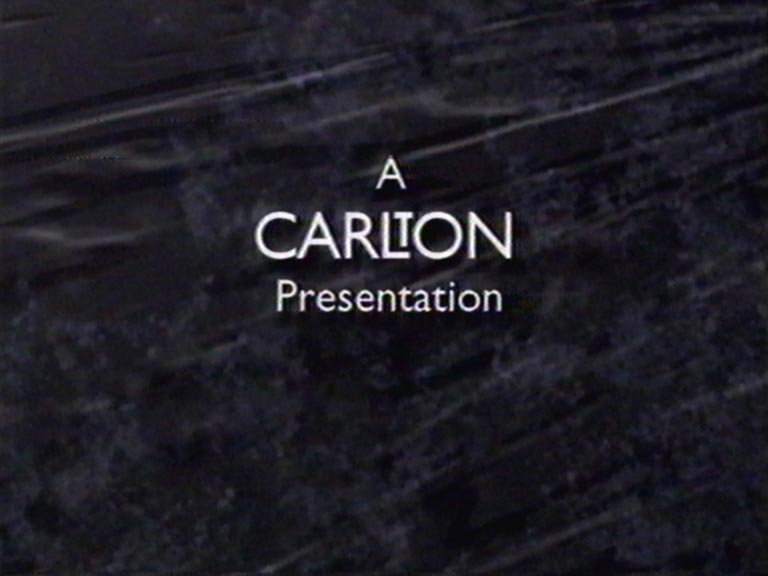
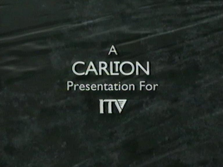
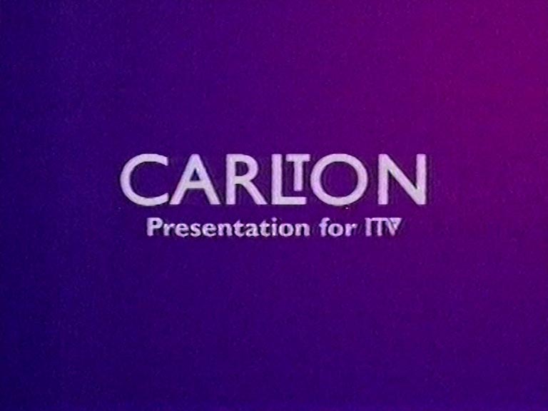
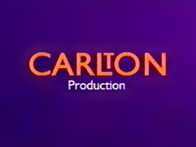
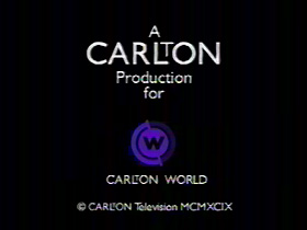
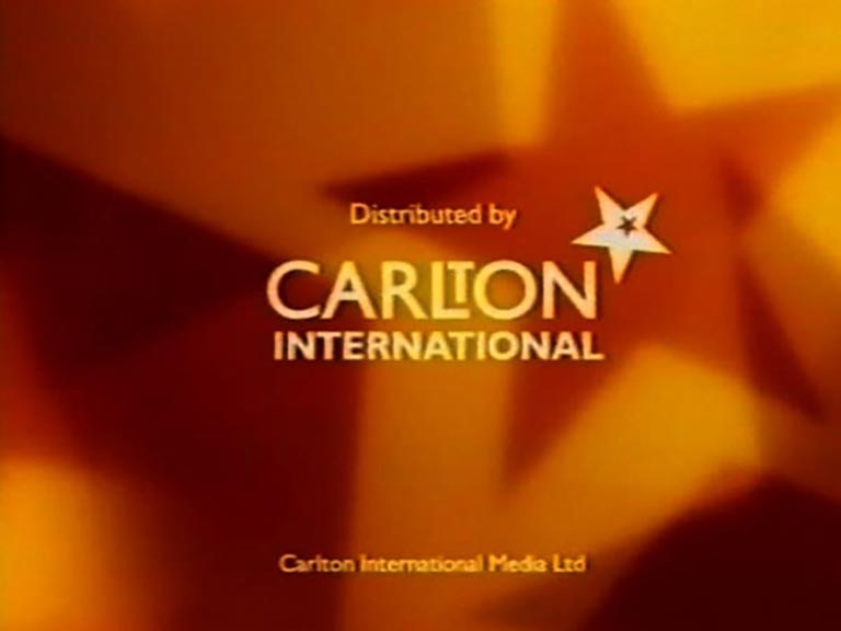
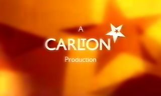
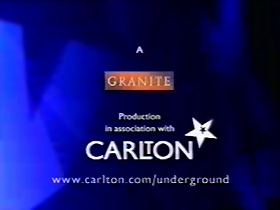
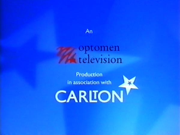
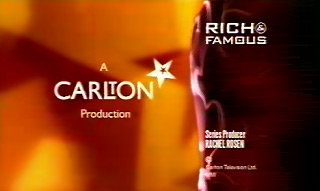
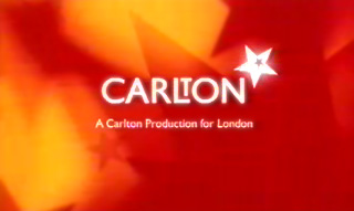
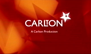
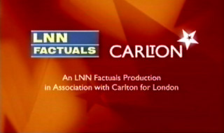
A Carlton PresentationA Carlton Programme End Board ~ The original Carlton end board, from 1993. The example on the left appears on a documentary series made by Wilcox Bulmer Productions for ITV, via Carlton’s Community Programmes Unit (CPU), A Day In The Life. The font – other than Carlton’s Gill Sans logo – is typical of the 1989 generic ITV lettering. The background is a defocussed plant silhouette, to match Carlton’s idents of 1993-96.Carlton PresentationCarltonCarlton PresentationEarly Days ~ Two end caps from a 1995 edition of Shift, a regional CPU production. One, containing the copyright statement, would have been seen only in the London region. The other is the standard caption as appended to all Carlton programmes of that time, network or regional. The purple caption appeared in 1996, to tie in with the new look idents.CarltonCarlton Presentation for ITV ~ 1994Carlton Programme for ITV ~ The purple caption appeared in 1996, to tie in with the new look idents.Carlton Presentation for ITVCarlton World End Boards ~ This end board (left) was used on one of the Carlton cable channels, Carlton World in 1999. The example (right) was seen on the same channel that year.Carlton ~ 1999 RelaunchCarlton Production ~ 4:3 examples, one from the regional ITV series Legends; the other from the Sky One production, Kirsty’s Home Videos.Carlton Production ~ Following the 1999 Lambie-Nairn ‘star’ make-over of the Carlton empire, which by now included Central, Westcountry and HTV, this end-board was adopted on all Carlton productions, regional and network. This is the 16:9 version. Right: a widescreen 1996-style purple end board, from a show made just before the big update…Carlton Co-Production ~ The standard, orange-starred end board was adpated for all varieties of production or co-production, with the starry new logo featuring on boards made up in the corporate colours of the respective independent production companies. First slide relates to Paul O’Grady’s Orient, shown on ITV in August 2000, a co-production between Carlton and Wildflower, the company owned by O’Grady’s manager Brendan Murphy.Carlton Co-Production ~ A blue starry background was sometimes used on programmes commissioned by Carlton’s regions or mini-network and made by external production companies. The example above, centre-left, from the London region, appeared on the series Underground – The Story of the Tube, made by Granite Productions. Meanwhile companies that co-produced with Carlton, sharing costs but not using Carlton production staff, were not been obliged to carry Carlton backgrounds. For example, TWI and Carlton co-financed The Second World War in Colour for ITV Network, but the production expertise was exclusively provided by TWI.Carlton Production ~ With the introduction of the ITV1 generic closing titles sequences in 2001, Carlton Productions slotted their orange, starry logo into the window to the left of the wavy neon line… Rich and Famous appeared on ITV1 Friday evenings, from August to December 2001.A Carlton Production for London ~ On 28/10/2002, ITV1 closing credit styles changed again. This sounded the death knell for the wavy, smoking neon line. Carlton’s final style of end board, adopted a red-and-orange starry background more in keeping with the corporate look of the company, with the spike of one large star rising through the centre of the graphic. This appeared on some regional productions prior to 28/10/02. The first example here, “for London”, is from the closing titles of Ask Ken, a regional debate seen on 19/09/2002. The second example is from a Carlton production for network ITV1, in December 2002. Family Fortunes to be precise. Third example from Bootsale Challenge, a programme made by LNN Factuals. Carlton re-scheduled the early series of Bootsale Challenge during weekdays in winter 2001, necessitating a new end board in keeping with the current “post 28th October” Carlton graphic style, but giving credit to LNN.
After February 2004 and ITV1’s “blue and yellow” rebrand, the Carlton identity was not seen on screen again.