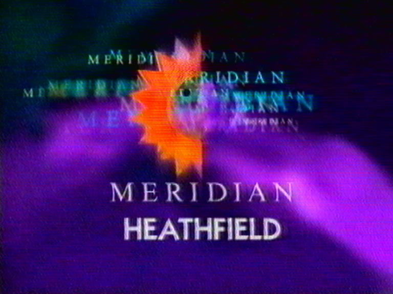
Meridian Ident
New, it's not
Quality: HQ
In September 1996 Meridian updated its ident and presentation. The new look was created in-house by J Dallas (Creative Director – Meridian Broadcasting) and his team, after a senior director disliked what an creative agency had originally designed. Dallas, J. said while speaking with George Holland in 1999 “The idea was they thought the Company had become established and the computer graphics for the original ident looked old fashioned. The problem with the logo is it looks stuck on to something what ever you do with it. With the second ident, what they wanted originally was to make the logo look more three dimensional. The second one didn’t work at all. It’s taken them years to realise what we’ve been telling them – that it doesn’t work! We’ve managed to persuade them that it’s better to go simple, but they’re wedded to the colours. It cost the least amount of money and it took the least amount of time to do”
New, it's not
Quality: HQ
New, it's not
Quality: HQ
New, it's not
Quality: HQ
New, it's not
Quality: HQ
New, it's not
Quality: HQ
New, it's not
Quality: HQ
New, it's not
Quality: HQ
New, it's not
Quality: HQ
New, it's not
Quality: HQ
New, it's not
Quality: HQ
New, it's not
Quality: ST
New, it's not
Quality: HQ
New, it's not
Quality: HQ