Thames Television Endboards
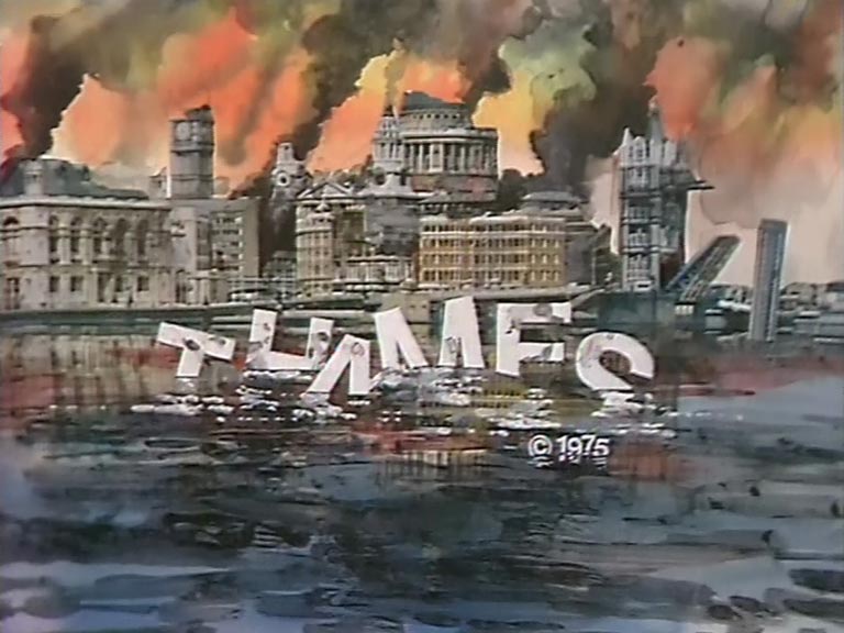
End boards are usually the final image to be seen on a TV show, explaining the name of the production company or copyright owner and sometimes also the year of production. In the modern television era, these graphics are animated, but the phrase ‘end board’ dates back to the ‘golden age’ of television with which TVARK is preoccupied, when they actually were small, flat pieces of card with artwork mounted on them, perhaps 3 x 4 inches in size and placed on a stand. To compliment our history of Thames idents, here is our collection of the company’s end boards from 1968 to 1992 as per original broadcast, along with end boards for shows repeated or reversioned up to the present day; we’re always on the lookout for more!
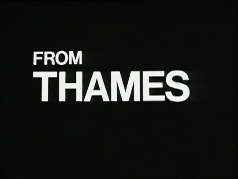
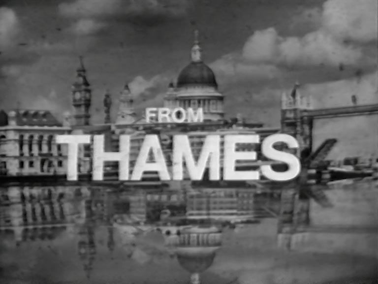
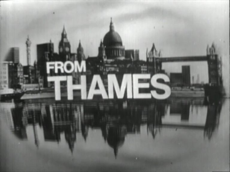
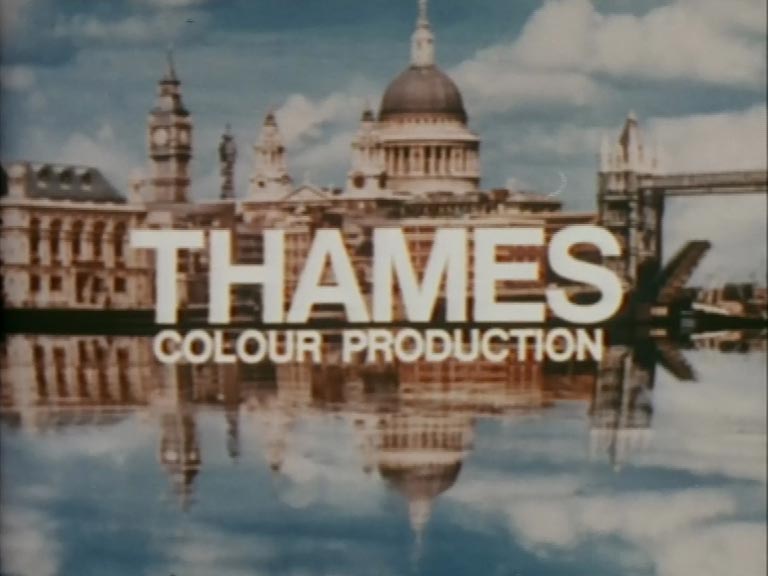
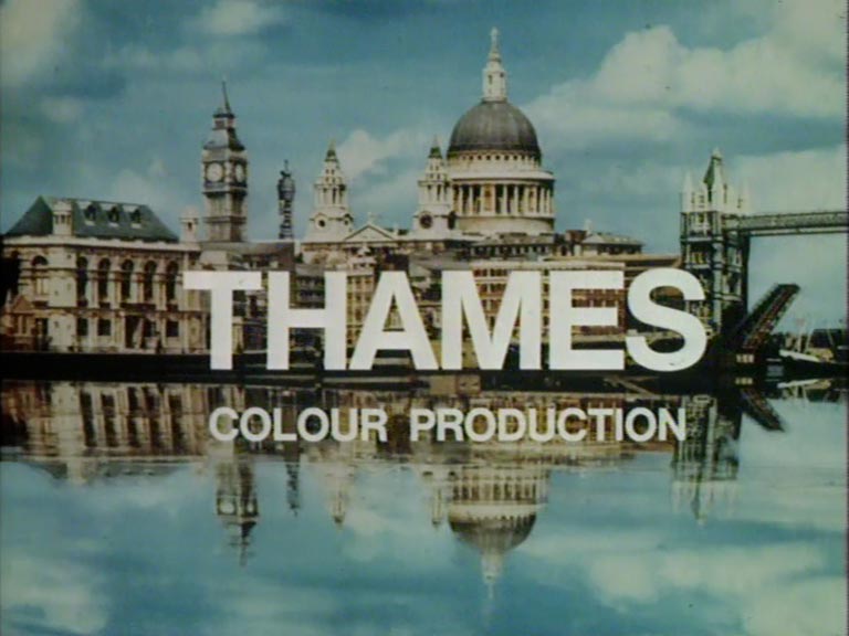
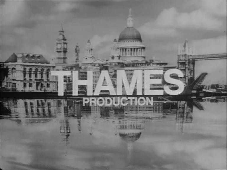
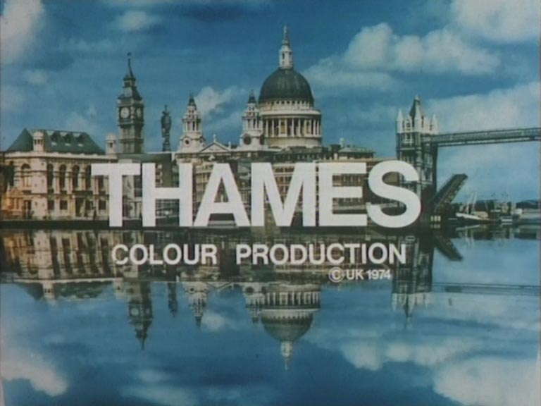
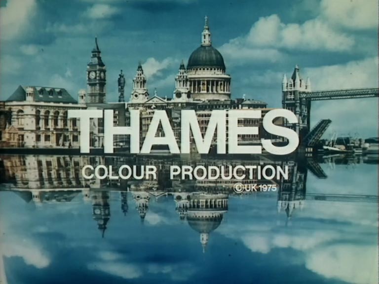
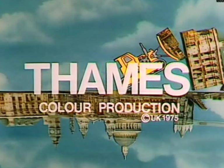
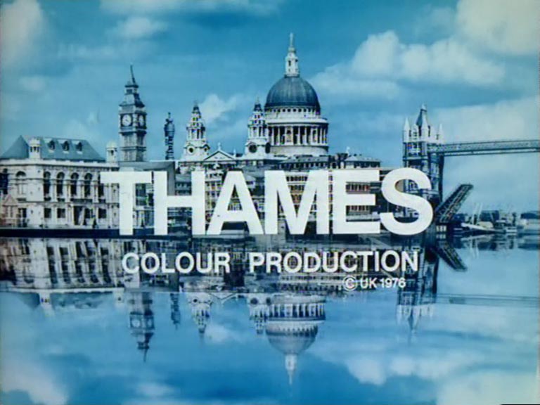
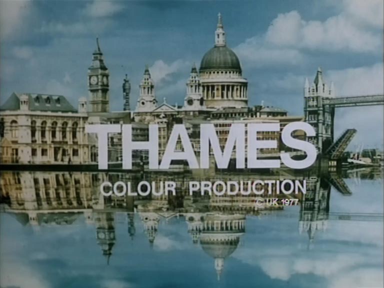
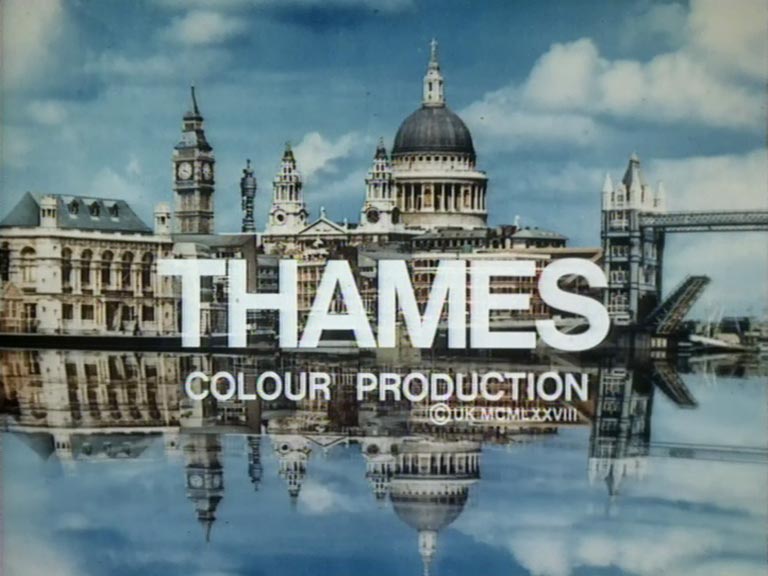
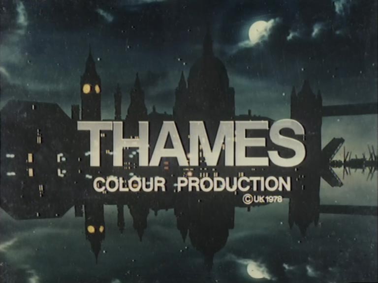
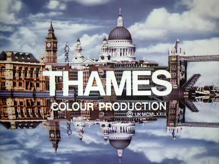
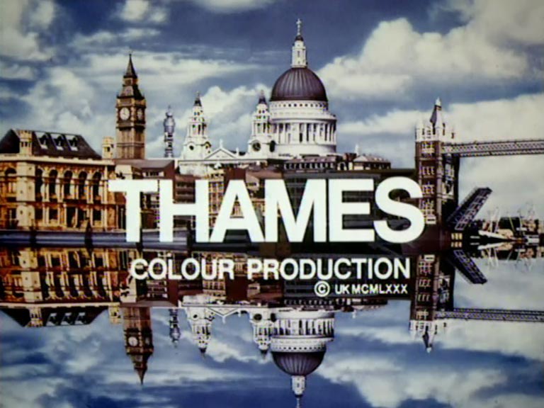
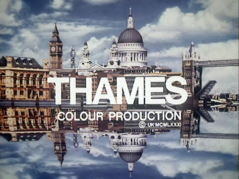
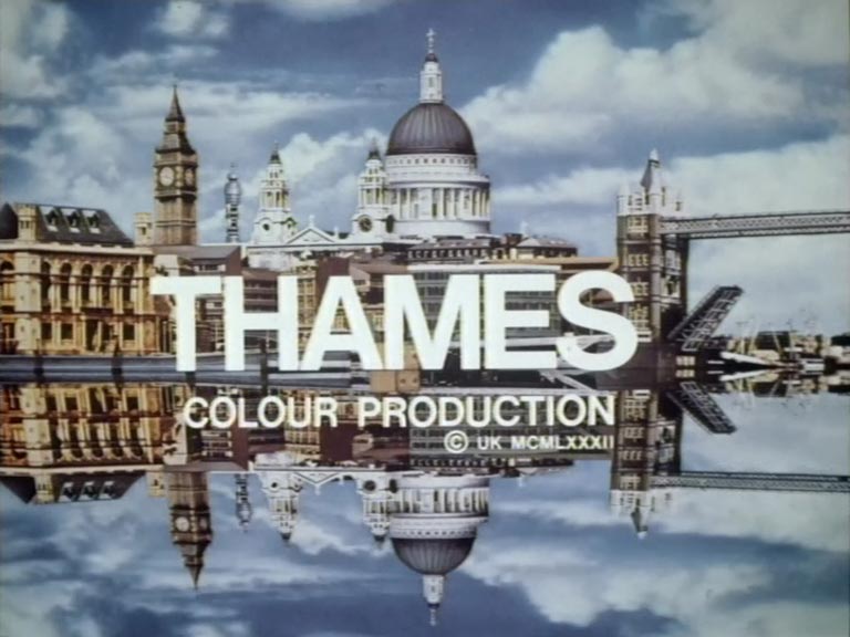
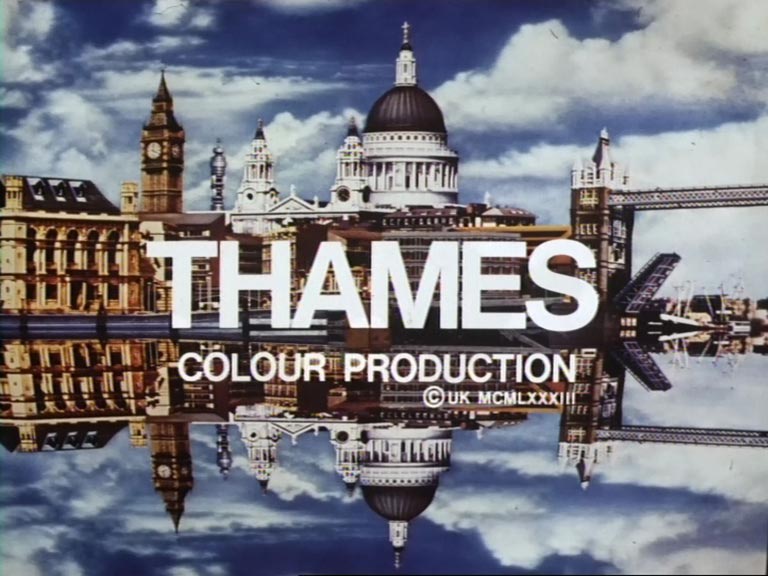
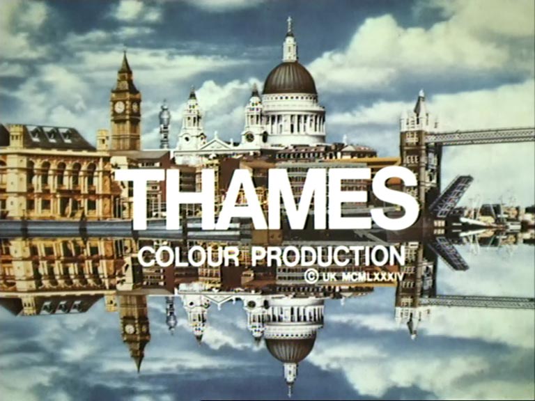
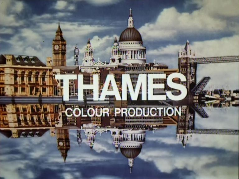

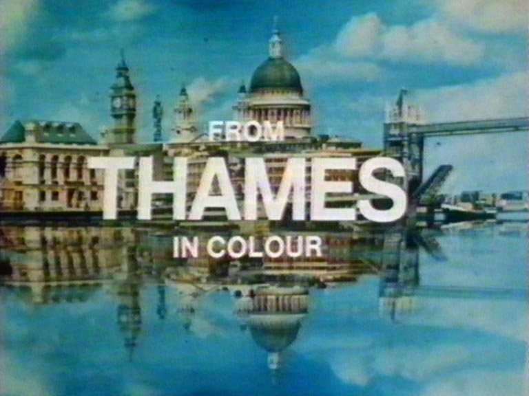
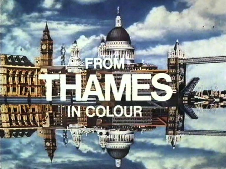
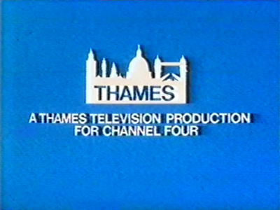
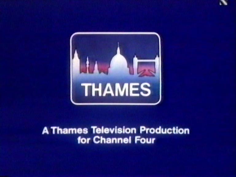

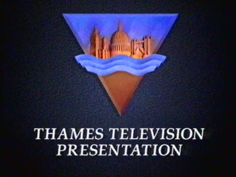
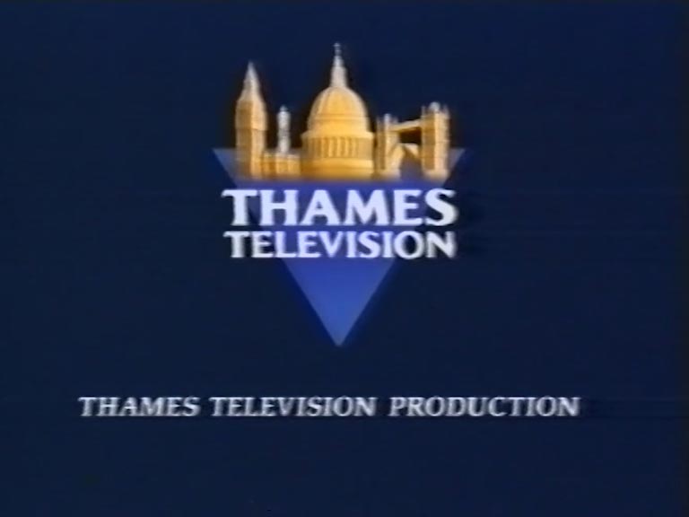
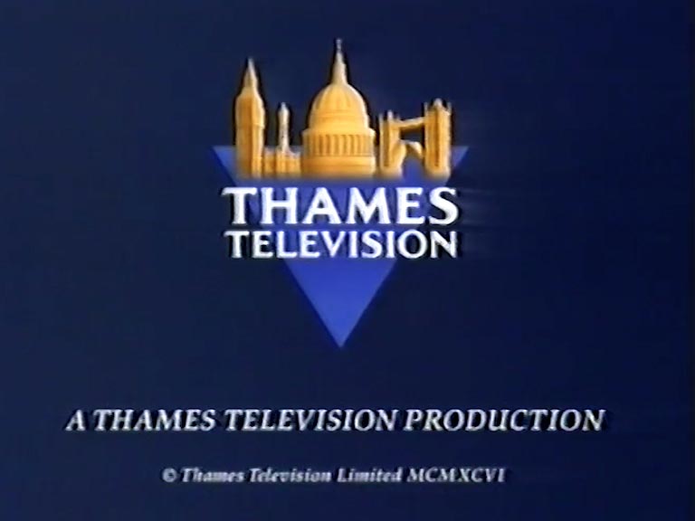
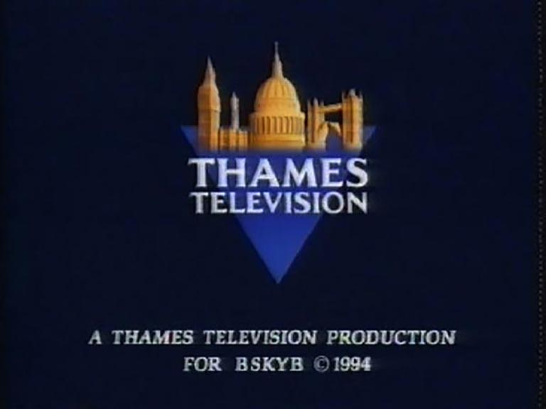
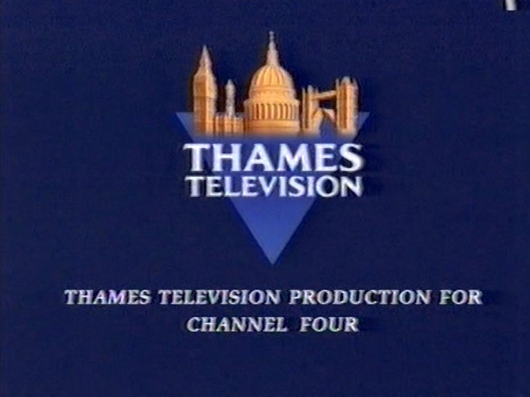
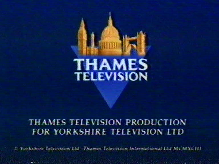
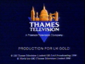
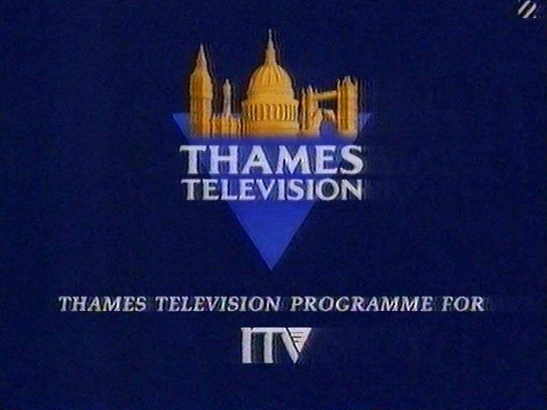
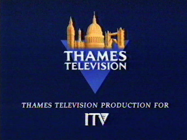
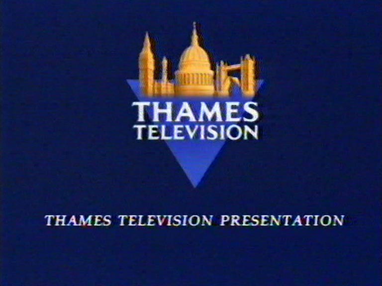
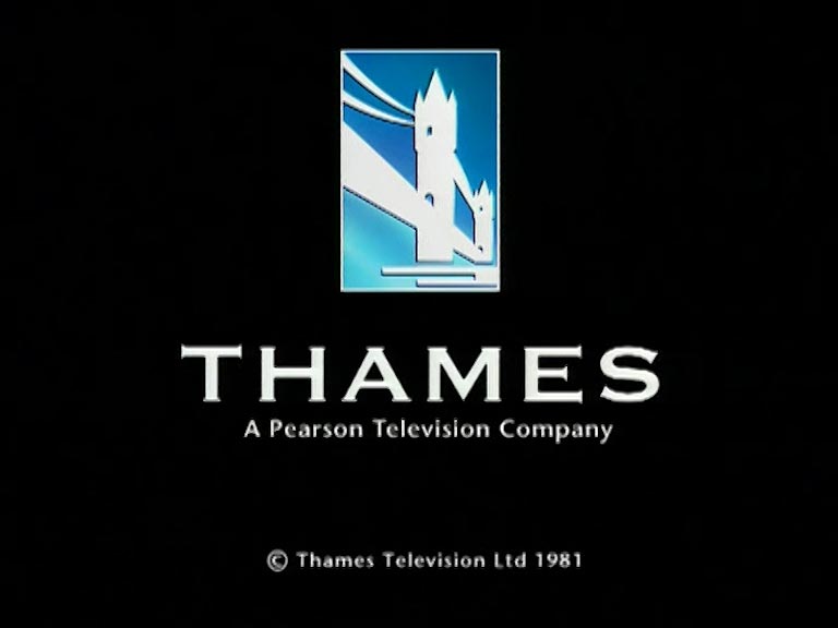
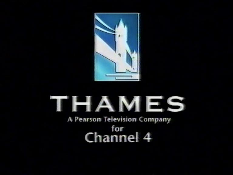
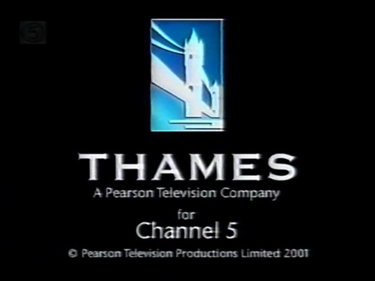
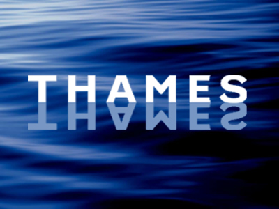
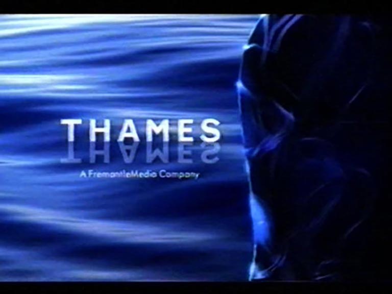
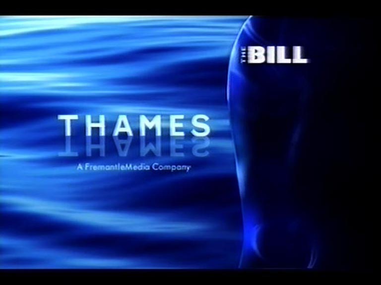
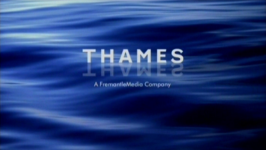
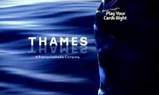
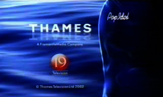
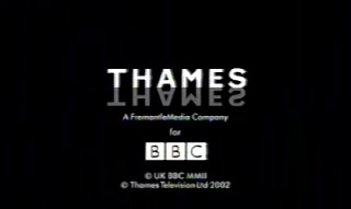
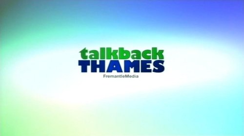
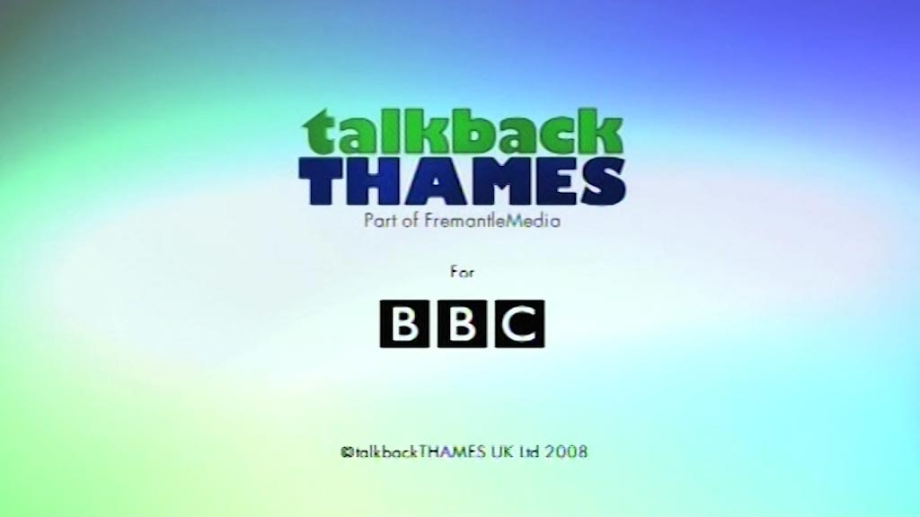
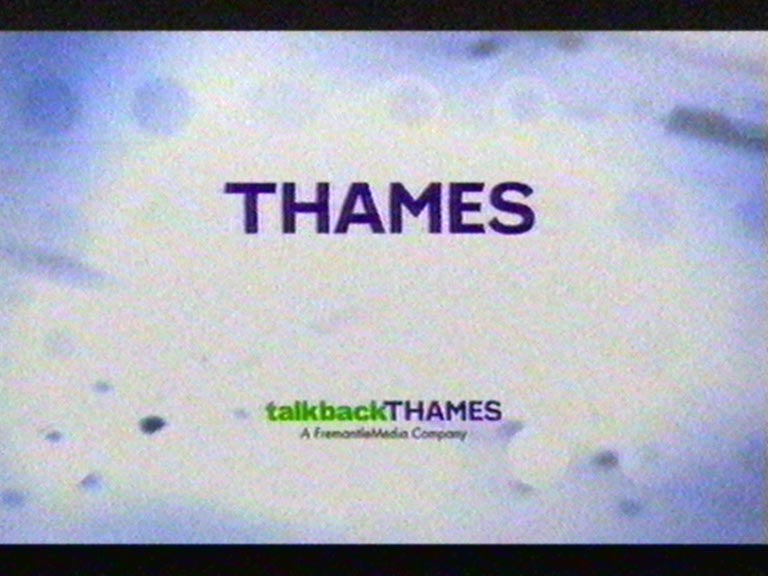
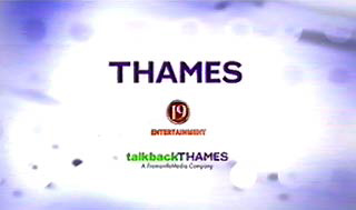
The earliest end boards simply stated “From Thames” or “Thames Colour Production”, but from the mid-1970s a copyright date was often given as well, sometimes in the form of Roman numerals. The last of the colour photographic skylines in the mid-1980s dropped the date again, since this was usually shown under the final name on the closing credit roller. After Thames lost its London weekday franchise in 1992, the company was taken over first by Pearson, and then Fremantle. Thames was a memorable brand and Pearson didn’t want people to be reminded of it, so the skyline idents and end-boards were usually removed from repeats or media re-issues of Thames programmes. New Thames programmes made in the Pearson era, such as The Bill or Heroes of Comedy, simply showed the Thames name in white lettering on black, with a stylised image of Tower Bridge placed above it. Repeats of old shows, such as 1973’s World at War, were given 1990s-style end-boards. When Fremantle bought Thames in 2001, they recognised the power of the brand name and were less insistent on replacing the skyline with their own logo, in which white paint spatters over a blue background. But they did update the Thames logo to show the letters floating over water. After which Thames merged with Talkback to form Talkback Thames, and further logos have been developed, many of which show the letters animating into their final position. There’s a chance that this page may be slightly more interesting than an episode of Looks Familiar.