Granada Continuity
Broadcast
1982
© Granada Television
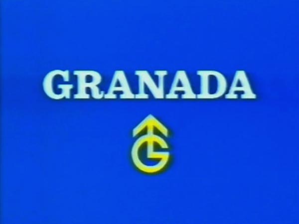
Notice how the Granada symbol was later re-drawn to appear thicker, and the spacing between the letters is tighter. The arrow was also shortned to be less tall.