Doctor Who
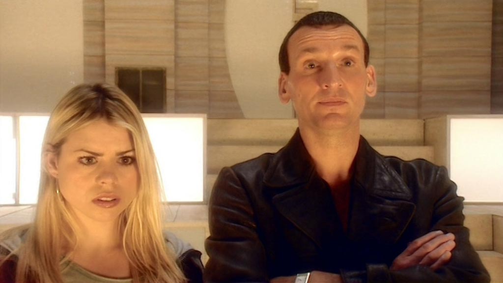
After nine years off air, Doctor Who returned to BBC1 at last. Critics scoffed that this revival of a ‘dead series’ would never work, but the 2005 version lived up to Newman and Lambert’s vision and single-handedly revived the fortunes of TV drama and Saturday night family viewing. In the twinkling of an eye, the capsizing pedalo of Doctor Who was regenerated into a gleaming flagship, thanks to the writing skills of Russell T Davies and the industrious team assembled at BBC Wales by producer Phil Collinson.
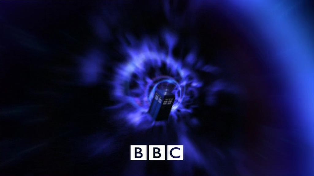
The series’ logo, first described by designer Louise Hillam as an ellipse, has become colloquially known as the ‘taxi sign’ logo, particularly in versions that favour internal illumination over the initially-seen metallic texture. Composer Murray Gold leaned heavily into the 1960s theme for treatment of the melody, which begins with a slightly-stretched version of the famous sting introduced in 1970.
Visually, the 2005 titles emulate 1974’s classic slit-scan sequence, though the pace is a heck of a lot faster and the entire sequence is computer generated, allowing the TARDIS to fly like thunder through the time vortex! The tunnel’s two primary colours evoke the ‘red shift’ and ‘blue shift’ of light that would theoretically be experienced when travelling at such speeds in different directions.