BBC North West Tonight Trail
New, it's not
Quality: HQ
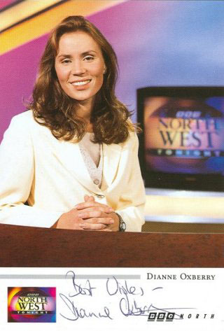
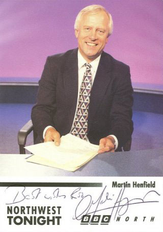
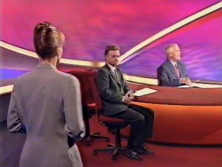
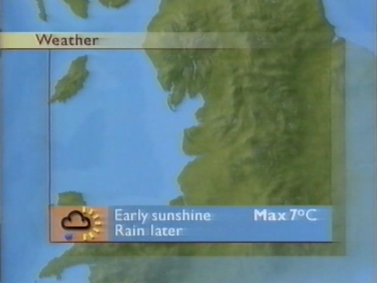
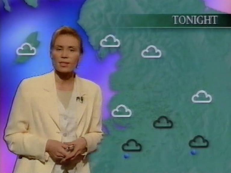
On the 25th September 1995 any sign of the BBC News ‘serious’ blue was no longer in sight. It was dropped in favour of a bright and bold colourful new look. Philip Hayton leaves, and Martin Henfield and Merryn Myatt take over the hotseat. A brand new weather slot was created and Dianne Oxberry was brought in to present (she’d previously worked on air at Radio 1, and before that on The 8.15 from Manchester) The radical new ‘spaceage’ set was designed by Christopher George, production designer of many entertainment programmes, whilst the graphics were designed by BBC in-house graphics designer Gareth Price. BBC North West’s regional output was given a cohesive look with it’s three programmes branded with glossy logos and identified through ‘colour branding’ . Warm reds and yellows for North West Tonight, blues and purples for Close Up North and turqouise and greens for Northwestminster.
New, it's not
Quality: HQ
New, it's not
Quality: HQ
New, it's not
Quality: HQ
New, it's not
Quality: HQ
New, it's not
Quality: HQ
New, it's not
Quality: HQ
New, it's not
Quality: HQ
Various bulletins here.. with presenters self-opting a mid morning and breakfast bulletins, just out of camera shot, their fingers press all the buttons to cut between her camera and the network, they did it all without looking down because all the buttons were different shapes, round, square, and triangular. Presenters do not self-op anymore.
New, it's not
Quality: HQ
New, it's not
Quality: ST
New, it's not
Quality: HQ
New, it's not
Quality: ST
New, it's not
Quality: ST
New, it's not
Quality: HQ
New, it's not
Quality: ST
New, it's not
Quality: HQ
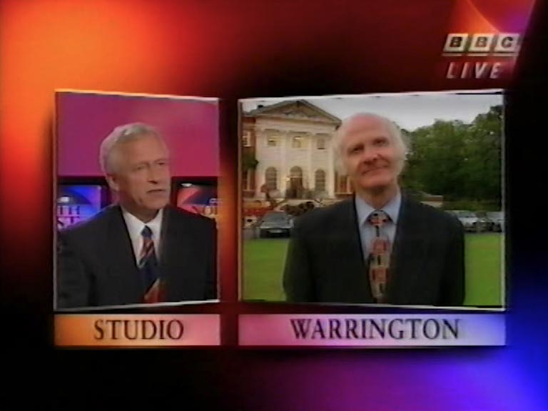
Examples of studio presentation
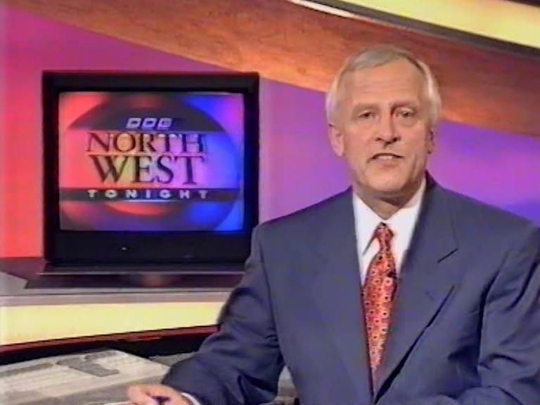
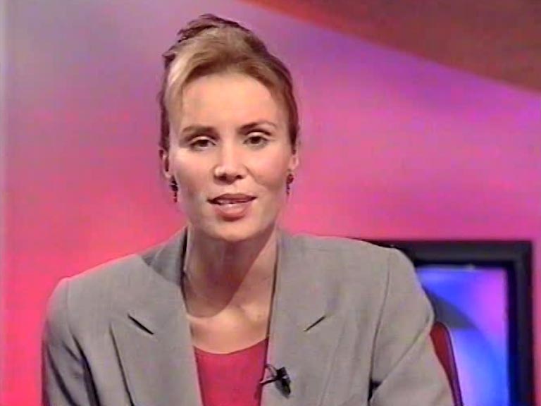
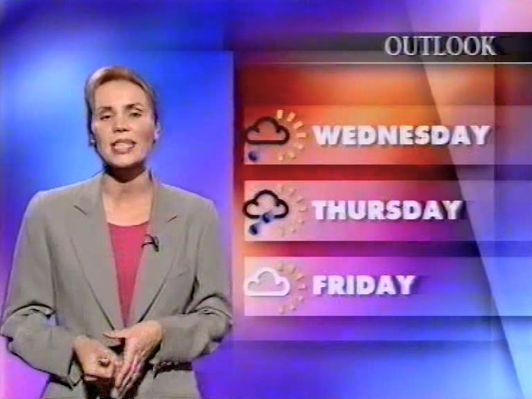
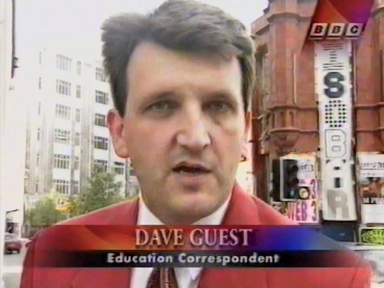
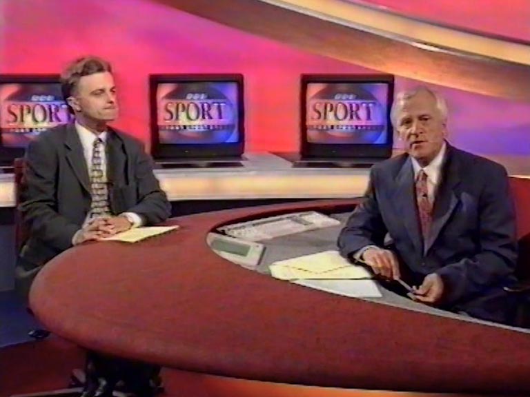
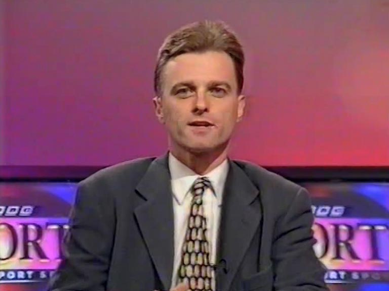
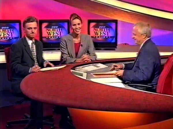
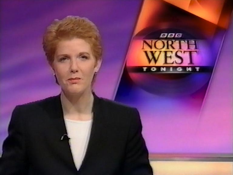
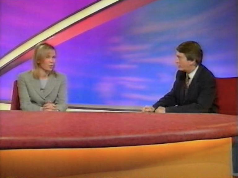
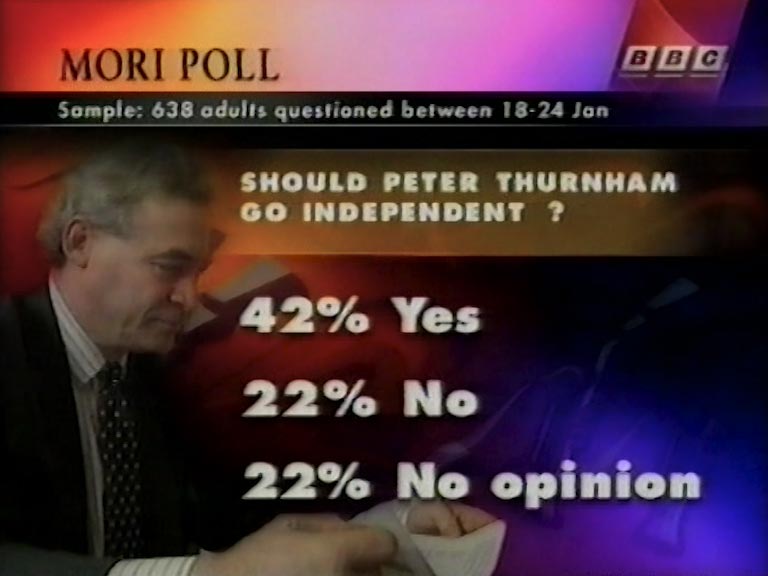
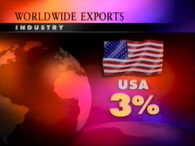
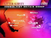
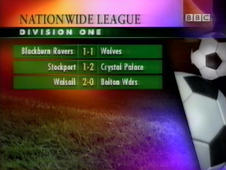
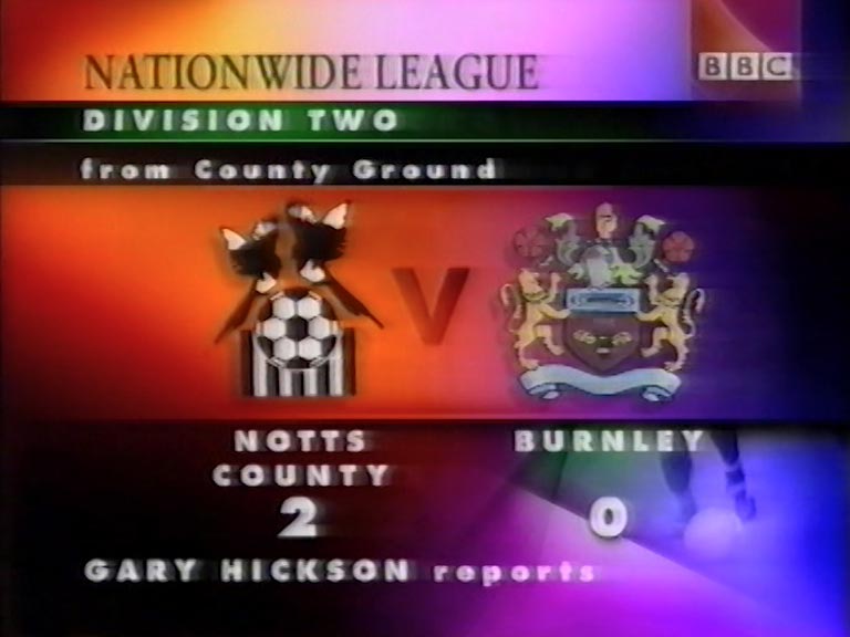
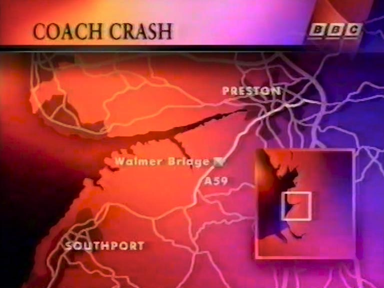
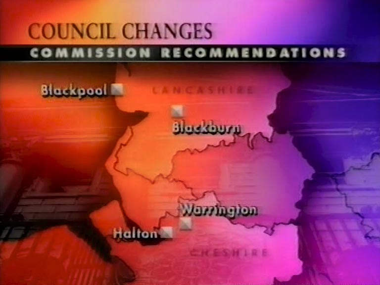
The mega colourful graphics theme continues through to the in-programme graphics
Promotional presenter postcards from this period
