BBC News 24 Countdown
New, it's not
Quality: LQ
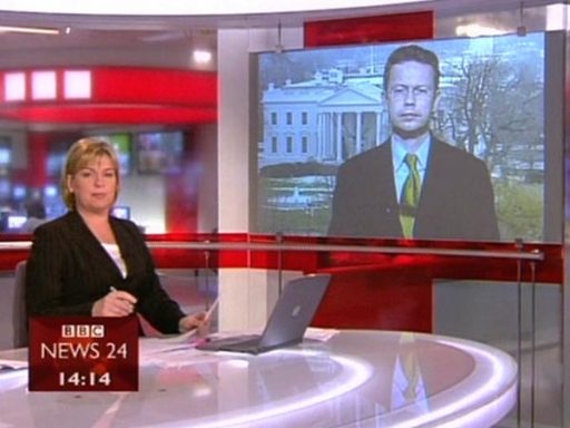
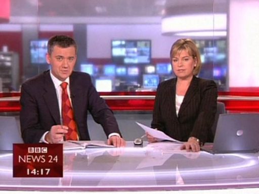
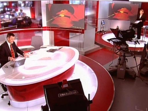
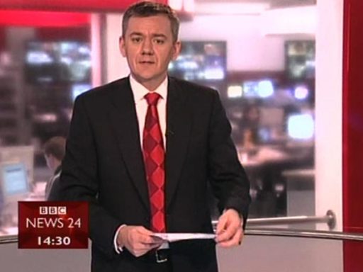
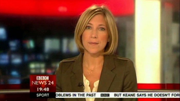
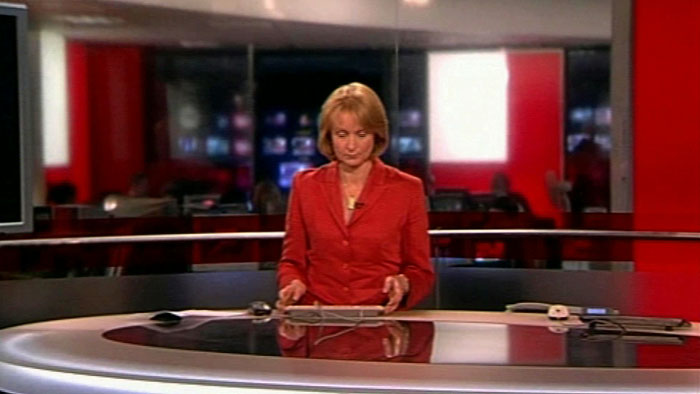
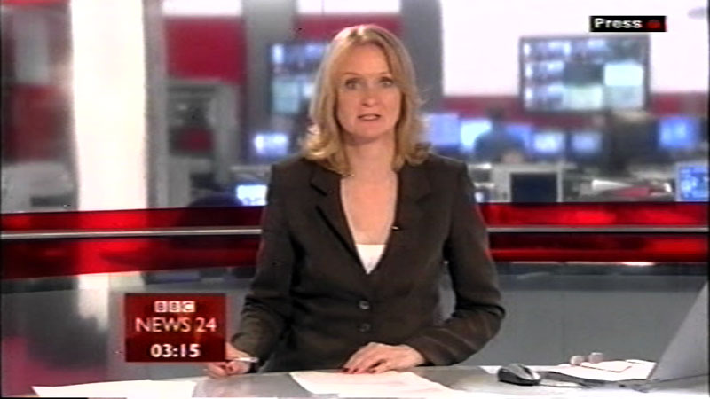
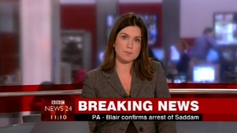
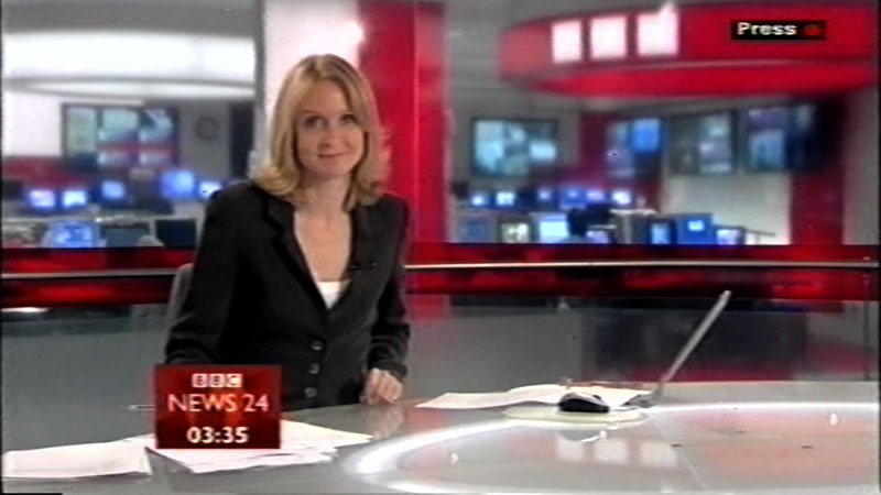
Monday 8th December 2003 saw BBC News 24 take on a whole new look, including a new set designed by Simon Jago, titles by in-house BBC News graphics and a re-work of the music by David Lowe. The new logo and graphics now fill the screen as much as possible, which was an intentional move to grab viewers attention and not be apologetic. The day’s top story feature as type circling the globe at the top of every hour The studio set is backed by glass walls revealing the newly rebuilt newsroom, it was considered this ‘opened up the news process to the viewers’ A couple of ‘new’ presenters were also called in, including stalwart Peter Sissons and Jon Sopel
New, it's not
Quality: LQ
New, it's not
Quality: LQ
New, it's not
Quality: ST
New, it's not
Quality: HQ
New, it's not
Quality: ST
In 2004 a graphics tweak – the News 24 logo becomes white and the orange hues of the clam shell become more red.
New, it's not
Quality: ST
New, it's not
Quality: HQ
New, it's not
Quality: HQ
New, it's not
Quality: HQ
New, it's not
Quality: ST
New, it's not
Quality: ST
New, it's not
Quality: ST
New, it's not
Quality: ST
New, it's not
Quality: ST
New, it's not
Quality: ST
New, it's not
Quality: ST
New, it's not
Quality: ST
New, it's not
Quality: ST
New, it's not
Quality: ST
New, it's not
Quality: ST
Examples of studio presentation and graphics

New, it's not
Quality: ST
New, it's not
Quality: HQ