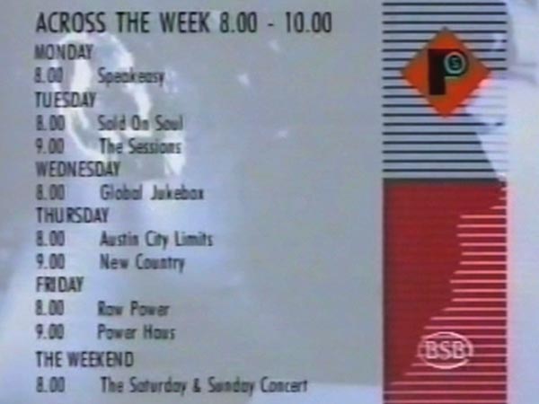
The Power Station Ident
New, it's not
Quality: HQ
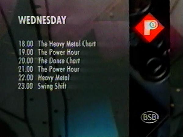
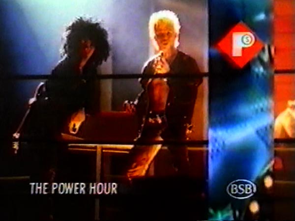
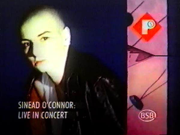
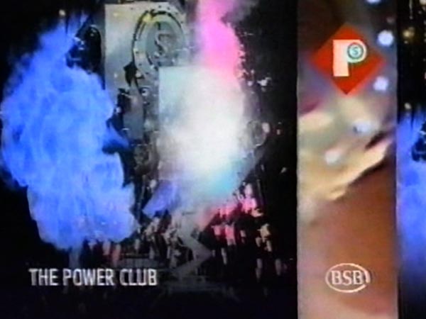
The Power Station offered a mix of youth and chart style programmes. It had a tough job creating an new identity against its powerful competitor MTV, who had a well established identity with innovative animation idents. The response was the idea of a machine with life that ultimately forms the logo. It was shot frame by frame, with highly skilled post production, resulting in a bizarre, dramatic but sophisticated ident.
New, it's not
Quality: HQ
New, it's not
Quality: HQ
New, it's not
Quality: HQ
New, it's not
Quality: ST
New, it's not
Quality: ST
New, it's not
Quality: ST
New, it's not
Quality: HQ
New, it's not
Quality: HQ
New, it's not
Quality: HQ
New, it's not
Quality: HQ
