MTV Ident – CCTV
New, it's not
Quality: HQ
MTV Europe was launched on August 1st 1987. Over the years in most European countries MTV Europe was replaced with their own various local versions of Music Television, UK version launched on 1st July 1997. MTV Europe is still going strong serving Iceland, Israel, Bulgaria, Greece, Cyprus and Malta.
Printed publicity materials from around the time of the channel launch….
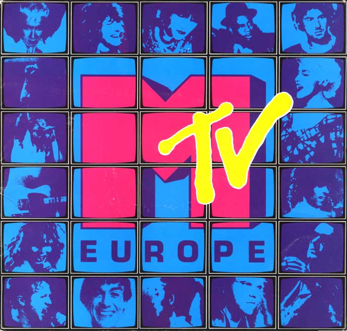

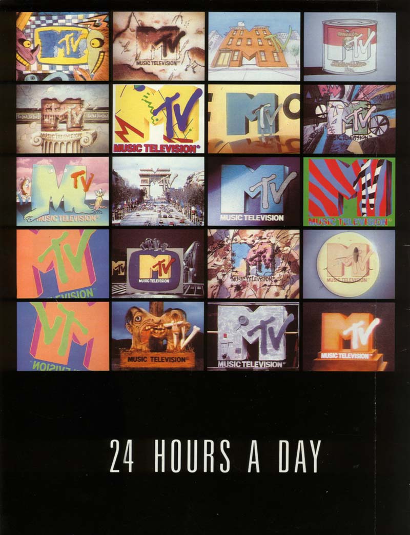
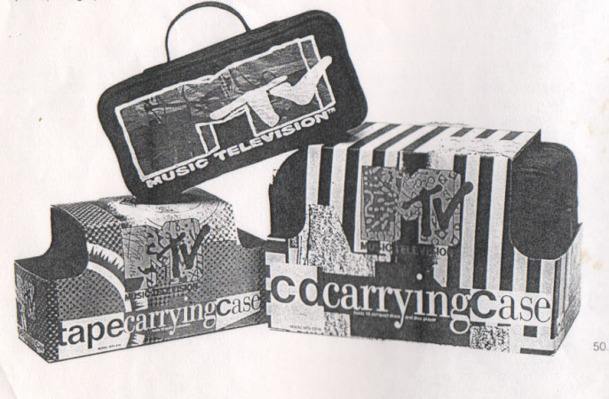
MTV has had an enormous effect on popular culture, influencing music, movies, fashion, graphic design and more. The world famous MTV logo is amongst a class of instantly recognisable worldwide symbols such as CocaCola and Disney. A basically blocky M (Gill Sans Extra Bold) and a spray painted ‘TV’ has remained the same. Reminiscent of the 20th Century Fox logo, it’s more than a 2-D image, as the shadow implies dimension, whist the spray painted TV implying action. The iconic MTV idents were the brainchild of Fred Seibert and Alan Goodman. They revolutionized television branding, with the concept of an ever changing logo with thousands of applications. MTV has always has a strong commitment to innovative graphic design, and for it’s US launch the network decided animation would be their main medium for station idents. For a practical reason as virtually all music videos at the time were live-action. They reasearched hard for animators, instead of large established ones, they chose people who specialised in alternative frame by frame designs, eg using crayon, cut-outs, metal etc.. “We wanted to do something everybody else was absolutely ignoring.” Below are just some of the results of the 10 second station idents used by MTV Europe in it’s early years onair. The channel easily had the most visually exciting television graphics of the time.
New, it's not
Quality: HQ
New, it's not
Quality: HQ
New, it's not
Quality: HQ
New, it's not
Quality: HQ
New, it's not
Quality: ST
New, it's not
Quality: HQ
New, it's not
Quality: HQ
New, it's not
Quality: HQ
New, it's not
Quality: HQ
New, it's not
Quality: HQ
New, it's not
Quality: HQ
New, it's not
Quality: HQ
New, it's not
Quality: HQ
New, it's not
Quality: HQ
New, it's not
Quality: ST
New, it's not
Quality: HQ
New, it's not
Quality: ST
New, it's not
Quality: HQ
New, it's not
Quality: HQ
New, it's not
Quality: HQ
New, it's not
Quality: HQ
New, it's not
Quality: HQ
New, it's not
Quality: ST
New, it's not
Quality: ST
New, it's not
Quality: ST
New, it's not
Quality: HQ
New, it's not
Quality: ST
New, it's not
Quality: ST
New, it's not
Quality: ST
New, it's not
Quality: HQ
New, it's not
Quality: ST
New, it's not
Quality: ST
New, it's not
Quality: ST
New, it's not
Quality: ST
New, it's not
Quality: ST
New, it's not
Quality: ST
New, it's not
Quality: ST
New, it's not
Quality: ST
New, it's not
Quality: ST
New, it's not
Quality: HQ
New, it's not
Quality: HQ
New, it's not
Quality: HQ
New, it's not
Quality: HQ
A few promotional trailers used here by MTV Europe…
New, it's not
Quality: HQ
New, it's not
Quality: HQ
New, it's not
Quality: HQ
New, it's not
Quality: ST
New, it's not
Quality: HQ
New, it's not
Quality: ST
New, it's not
Quality: ST
New, it's not
Quality: HQ
New, it's not
Quality: HQ
New, it's not
Quality: HQ
New, it's not
Quality: HQ
New, it's not
Quality: HQ
New, it's not
Quality: HQ
New, it's not
Quality: HQ
New, it's not
Quality: HQ
New, it's not
Quality: HQ
New, it's not
Quality: HQ
New, it's not
Quality: ST
New, it's not
Quality: HQ
New, it's not
Quality: ST
New, it's not
Quality: ST
New, it's not
Quality: ST
New, it's not
Quality: ST
New, it's not
Quality: ST
New, it's not
Quality: ST
New, it's not
Quality: ST
New, it's not
Quality: ST
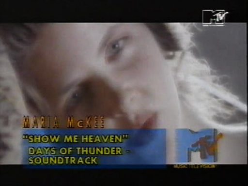
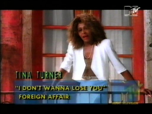
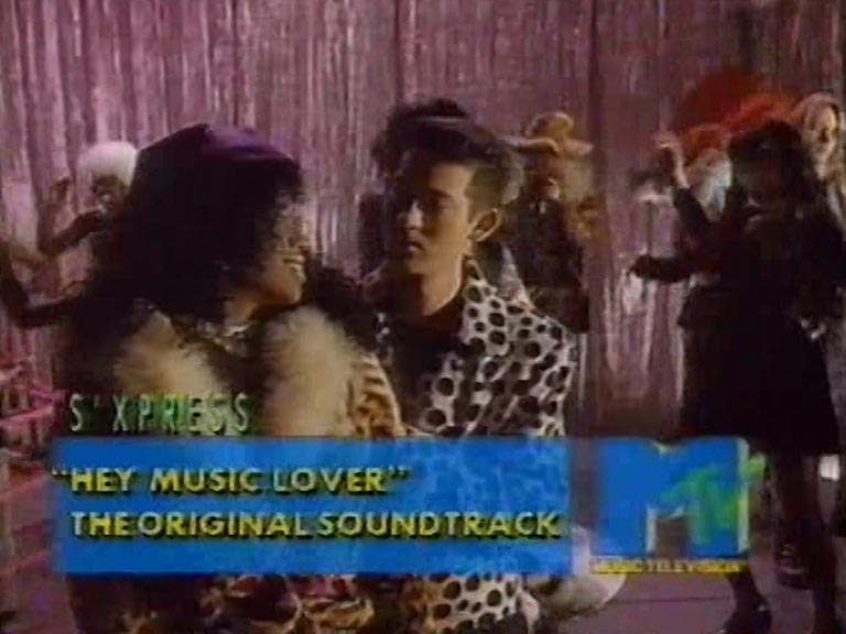
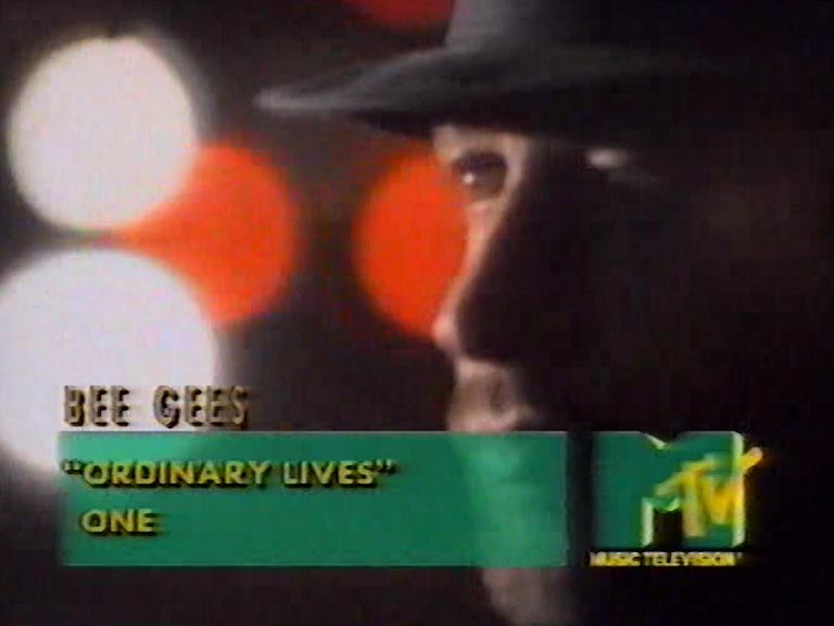
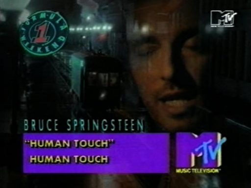
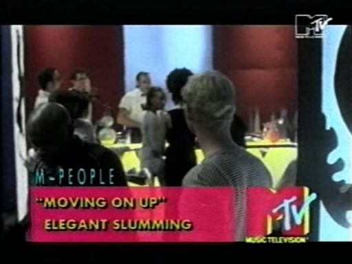
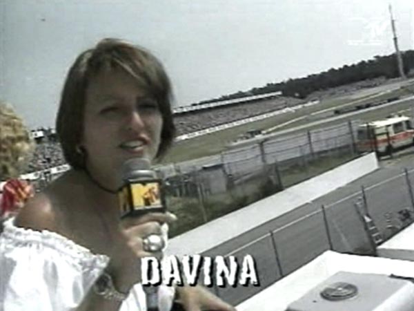
Examples of track listing astons…


New, it's not
Quality: ST
New, it's not
Quality: ST
New, it's not
Quality: ST
New, it's not
Quality: ST
New, it's not
Quality: ST
New, it's not
Quality: ST
New, it's not
Quality: ST
New, it's not
Quality: ST
New, it's not
Quality: ST
New, it's not
Quality: ST
New, it's not
Quality: ST
New, it's not
Quality: ST
New, it's not
Quality: ST
New, it's not
Quality: ST
On 8th February 2010, MTV began offically using the revised 2008 logo, for the channel presentation. The channel’s full name “Music Television” was officially dropped, with the revised logo largely the same as the original logo, but without the initialism, the bottom of the “M” being cropped and the “V” in “TV” being branched off.Dave Howe, president of Syfy Said “MTV realised being ‘music television’ was too limiting, the right brand is essential to cut through the noise and clutter of the media explosion bedevilling the TV industry.
New, it's not
Quality: HQ
On June 25, 2015, MTV International rebranded its on-air look with a new vaporwave and seapunk-inspired graphics package. It included a series of new station IDs featuring 3D renderings of objects and people, much akin to vaporwave and seapunk “aesthetics”. The new look was desgigned by MTV own in house team “World Design Studio” (later changed to World Creative Studio) with help from creative agency B-Reel. A new slogan was also created “I Am My MTV
In January 2018, MTV rebranded its package or TV channel while humanising branding to create a more unformed looked across its operations. The new look was designed in house by World Creative Studio.A spokesmen said “Teens are living, breathing and sharing emotions like no other moment in history. The insights that we learn from them are reflected through branding – it’s branding based on emotions. The emotions covered in the new identity range from relaxed and trippy to sexy and anger, and have been visualised by different studios and artists either as graphic or short form video idents. Each emotion has also been expressed using a specific colour, such as orange for excited and blue for sad.Every four months, World Creative Studio will also commission four new artists from all over the world to create a 15-second animated art piece based on one emotion and an accompanying colour.