Nickelodeon Ident
New, it's not
Quality: ST
The iconic Nickelodeon look was created by Hatmaker in conjunction by Fred Seibert and Alan Goodman at MTV Networks. Going one step further from the MTV logo, the Nickelodeon logo *itself* changes – it could be an orange blimp, a splat of paint, a dinosaur, anything. The only constant is the easily identifiable font and the color orange. With its constantly changing shape and bright orange color, the Nickelodeon logo is well-suited to animation; it also embodies both the random playfulness and the comforting routine of childhood.Most of the idents were used in the US and created by various animation and design houses: the most striking feature of the early idents is the decidedly retro nature.
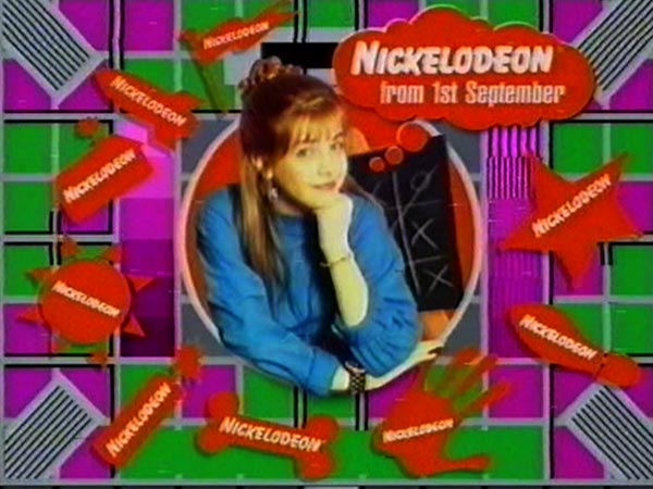
On 1st September 1993 Nickelodeon UK launched as part of the Sky Multichannels package. Most of the presentation was taken from the US counterpart. However there were Live presenter during this period which included Rick Adams, Mike McClean, Myk Scarlett, Nigel Mitchell, Malcolm Bird, James Gilbey, Matt Brown, Lucy Alexander and Mounya Khamlich.
New, it's not
Quality: ST
New, it's not
Quality: ST
New, it's not
Quality: ST
New, it's not
Quality: ST
New, it's not
Quality: ST
New, it's not
Quality: ST
New, it's not
Quality: ST
New, it's not
Quality: ST
New, it's not
Quality: ST
New, it's not
Quality: ST
New, it's not
Quality: HQ
New, it's not
Quality: HQ
New, it's not
Quality: ST
The Testcard used by Nickelodeon.
On 6th May 2002, Nickelodeon revealed a new 'splat' design, created by Designers Republic, which secured the project in a competitive pitch against, Malcolm Moore Deakin Hutson, Static, Digit, Shynola, Wildbrain and Blue Source. The new branding was created "a less cluttered appearance and give its orange look supreme dominance".Steve Shannon, creative director at Nickelodeon, said: "Our look at the moment doesn't translate well off-air. We want to stick out more and have an almost 'Stalinist-style' look that works well in any environment. The splat represent "how kids felt about rules, authority and being tidy", but the new logo is designed to "work everywhere, and play well with others". We have no clips at present.
We have no clips at present.
By the spring 2005, the presentation was updated, however the splat design was kept. We have no clips at present.
We have no clips at present.
On 7 March 2009, the channel rebranded to a 'fantasy' look, which was created by "Mainframe" Designs. We have no clips at present.
We have no clips at present.
On 15th February 2010 Nickelodeon unviled a new look are part of a global rebrand which was the first time the international network has shared the same logo and on-air identity, replacing the previously used "splat".Nickelodeon UK vice president of creative Peter Drake said "The new logo will be a "simple, bold and timeless typographical execution which retains a link with the network's heritage while giving it a more contemporary feel. The channel rebrand signals a new global focus for the network; and an extremely exciting time for Nickelodeon. The look is fresh, contemporary and addresses the needs of our audiences in a more relevant way. This simple and succinct execution offers a consistent stamp of approval which allows our characters, brands and properties to shine through – and do the talking. It has a contemporary feel and effectively enables us to leverage the power of our brands globally."At the same time Nickelodeon UK also revealed plans to revamp its flagship pre-school mini-sites under the Nick Jr's brand to offer better structure and navigation.We have no clips at present.
We have no clips at present.
On the starting 13th March 2017 Nickelodeon was given a new visual identity with the aim of putting "real kids at the centre of the brand. The new design was created by Argentina-based consultancy Superestudio alongside Nickelodeon's in-house creative team, Superestudio said "no frills, modern sans-serif typeface Galano Grotesque is used for copy across graphics, which aims to be legible as this is "key for kids. The typeface stays consistent in size and kerning but uses colour as a point of difference to advertise different TV shows. What is cool about this branding is that kids can see themselves interacting with what they usually see inside a screen in an unpredictable and fun way, he says. "This attracts their attention and helps them feel represented at the same time.Michael Waldron, senior vice president creative director of art and design at Nickelodeon Said: "The logo has been tweaked by changing the lighting, and making the three-dimensional effects subtler to make it cleaner and more modern. Each letter form can also be personalised with animations, to give them individual personnel, thus making the channel appear more real, more playful and more unexpected.We have no clips at present.
We have no clips at present.