Thames News
New, it's not
Quality: HQ
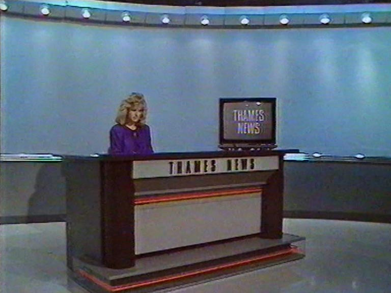
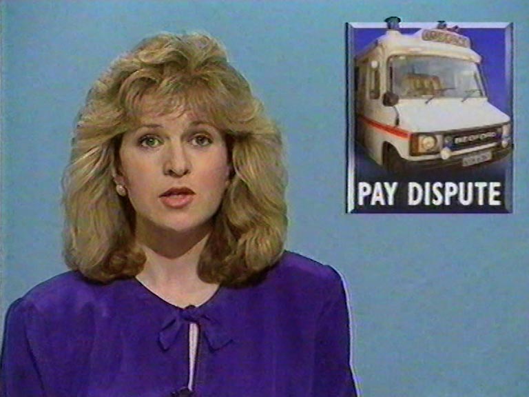
Thames News was given another overhaul, in early 1989. The new logo was computer generated, rendered as if written in shiny steel lettering and placed on a weathered steel background. The title music became a strident fanfare. The studio set for main bulletins was given a plain blue background, while shorter bulletins took place on a grey set. We have various examples below:
New, it's not
Quality: HQ
New, it's not
Quality: ST
New, it's not
Quality: ST
New, it's not
Quality: HQ
New, it's not
Quality: ST
New, it's not
Quality: ST
New, it's not
Quality: ST
New, it's not
Quality: HQ
New, it's not
Quality: ST
New, it's not
Quality: ST
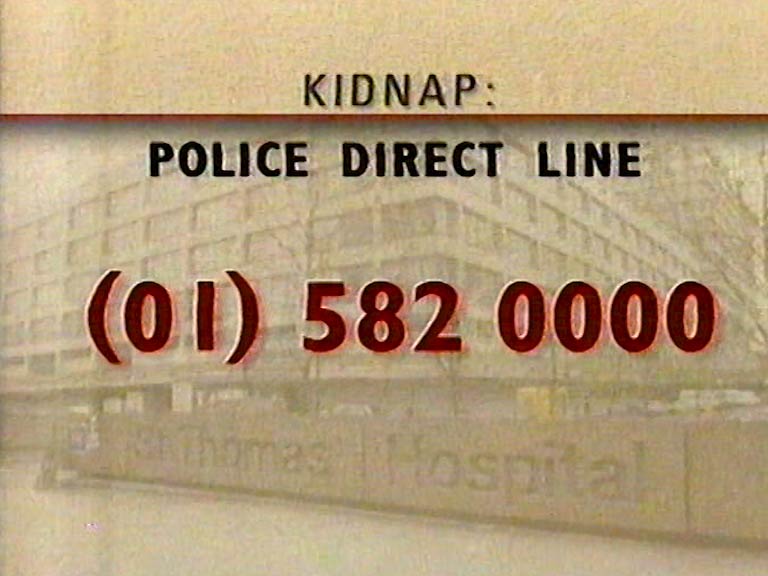
Examples of studio presentation and content graphics


