BBC Weather – Elizabeth Saary
New, it's not
Quality: HQ
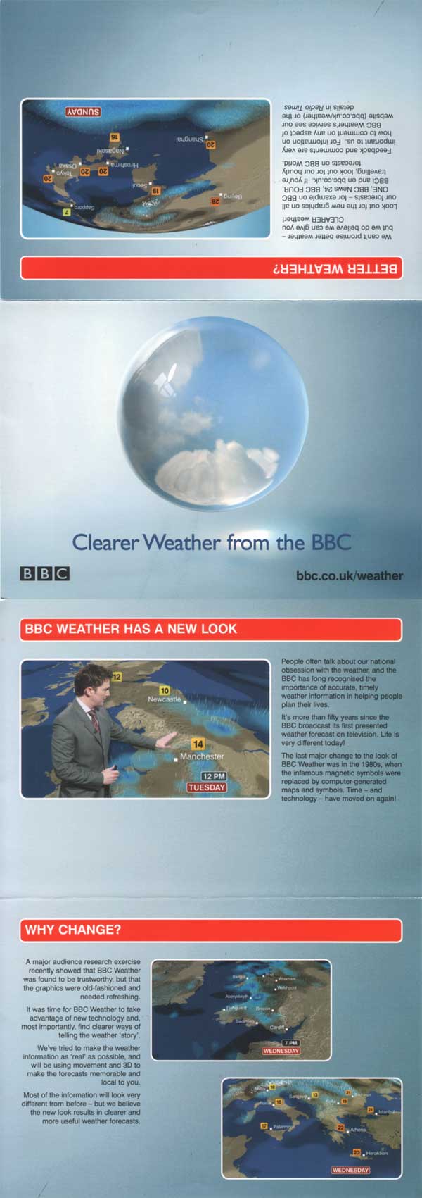
On May 16th 2005 the BBC rolled out a brand new look across all it’s channels and the web. BBC Weather bought Weatherscape XT, sophisticated software from Metra to exploit advances in 3D graphics and animation to visualise the weather. Sadly the friendly symbols are history and now cloud and rain are represented as ‘real’ shadows and ‘real’ raindrops on a desert sand coloured map of the UK.
We feel the redesign was a backwards step, as you now have to watch the entire weather bulletin to understand what is happening, and to make sure you don’t miss your part of the country as the map flies around the screen. The old presentation might not have been as visually dynamic, but it was much easier to understand ‘at a glance’. Let’s hope it becomes fashionable and gets re-introduced!
Quotes from BBC News: “They have been introduced after audience research found viewers felt the current graphics were out of date.” “The new system will introduce more realism, movement and clarity,” said the BBC’s lead presenter Helen Young.
Unsuprisingly the contoversial new look did not go down well with viewers. Over 4,000 people complained that the North, and especially Scotland was really badly represented because they were so small on the map compared with the South of England. It only took the BBC less than 2 weeks to change the titled perspective map back to a more head-on version.
Even the former head of the BBC Weather Centre, John Teather voiced his opions in the press, saying “he was depressed by the 3D graphics, which did nothing to help viewers understand the forecast, those responsible for the £1 million makeover had shown a wilful disregard for all that we learnt over the past 25 years.”
New, it's not
Quality: HQ
New, it's not
Quality: HQ
New, it's not
Quality: ST
New, it's not
Quality: HQ
New, it's not
Quality: ST
New, it's not
Quality: ST
New, it's not
Quality: ST
New, it's not
Quality: ST
New, it's not
Quality: HQ
New, it's not
Quality: HQ
New, it's not
Quality: HQ
New, it's not
Quality: ST
New, it's not
Quality: ST
New, it's not
Quality: HQ
New, it's not
Quality: HQ
New, it's not
Quality: HQ
New, it's not
Quality: ST
New, it's not
Quality: HQ
New, it's not
Quality: ST
New, it's not
Quality: HQ
New, it's not
Quality: ST
New, it's not
Quality: HQ
New, it's not
Quality: HQ
New, it's not
Quality: HQ
New, it's not
Quality: HQ
New, it's not
Quality: HQ
New, it's not
Quality: HQ
New, it's not
Quality: HQ
