Thames News (Morning Bulletin)
New, it's not
Quality: ST
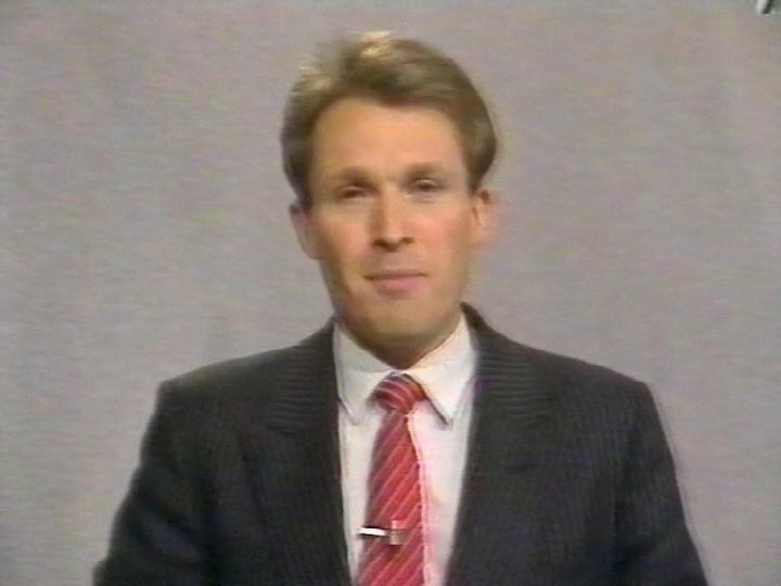
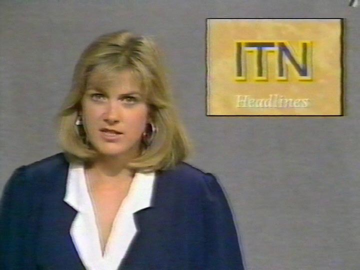
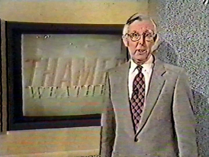
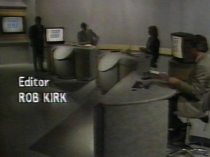
Following the “blue graph paper” era of studio and graphic design, the Thames News set, titles and music were given three complete revisions in January 1988 with a symphony of beige and grey. The titles were updated to give the viewer a travelling point of view along a square tunnel of moving images. This opened out into a TV studio gallery with a central programme monitor, on which the bulletin logo forms. For the main 6pm bulletin, the studio turned a shade of plain grey with oddly shaped desks picked out in shades of grey and beige. The various headline bulletins were broadcast from a plain beige set, with the new logo placed upper left on screen, behind the newscaster’s right shoulder.
New, it's not
Quality: ST
New, it's not
Quality: HQ
New, it's not
Quality: ST
New, it's not
Quality: HQ
New, it's not
Quality: HQ
New, it's not
Quality: HQ
New, it's not
Quality: HQ
New, it's not
Quality: HQ
New, it's not
Quality: HQ
New, it's not
Quality: ST
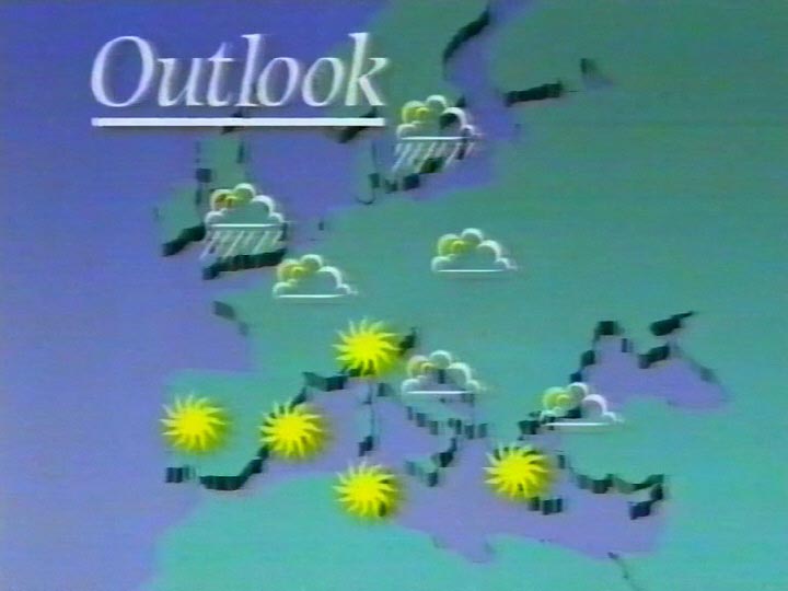
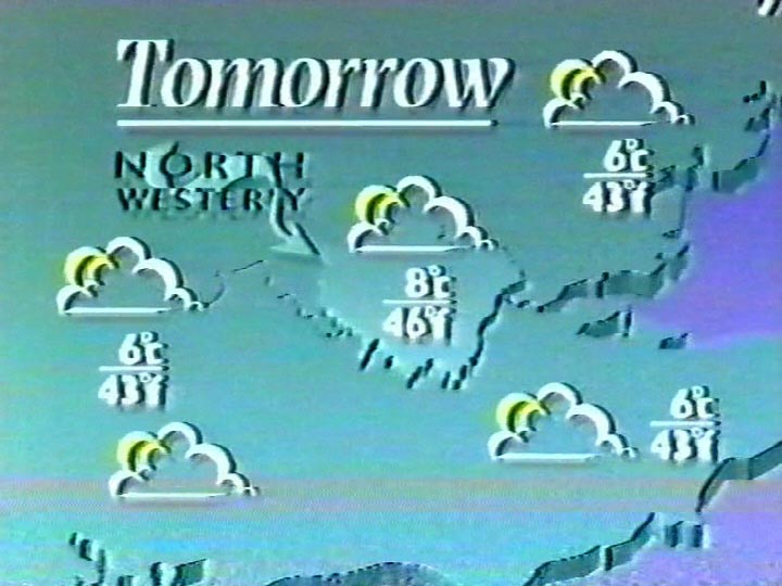
Examples of studio presentation and graphics
