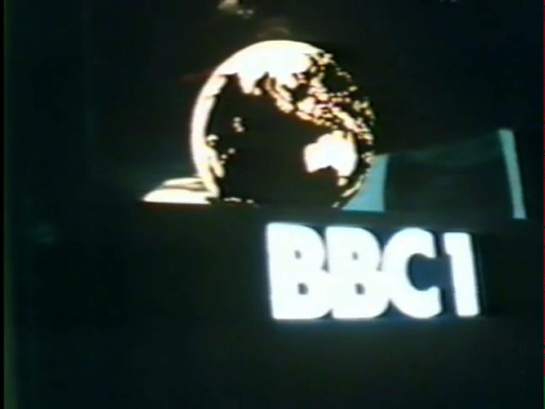
In the mid-1970s, as colour television sets became increasingly widespread, BBC1 transitioned its colour scheme to a more vibrant yellow-on-blue. Rather than adopting the “twin-striped” ident introduced in 1974, decision-makers chose to retain the iconic Futura Bold typeface. Interestingly, the initial iteration of this “new” globe utilised the same model as its predecessor.
However, by 1978, a redesigned globe made its debut, featuring several notable modifications. The space between the globe and the BBC1 legend was expanded, and the globe itself was re-imagined. In this updated version, the North Pole appears noticeably smaller, allowing the continents to occupy more of the sphere, while the reflection takes on a more flattened aesthetic.
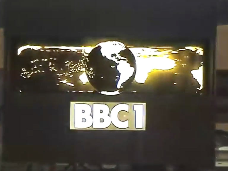
Following the globe redesign in late 1974, BBC 1 persisted in using slides reminiscent of its 1969 style. However, these eventually evolved into the iconic “twin-stripe” stills, which graced the channel from approximately 1976 until the latter part of 1983. These slides were unique in featuring an alternative BBC 1 logo, accompanied by the programme title set in Eurostile typography.
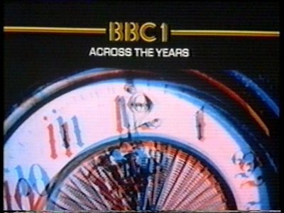
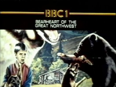
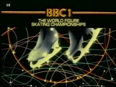
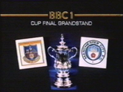
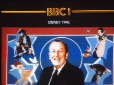
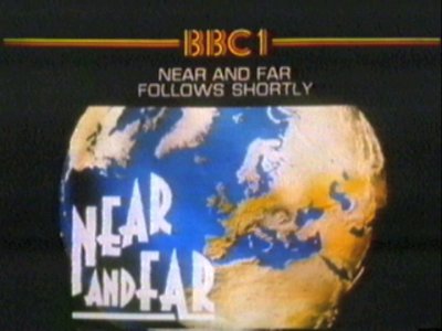
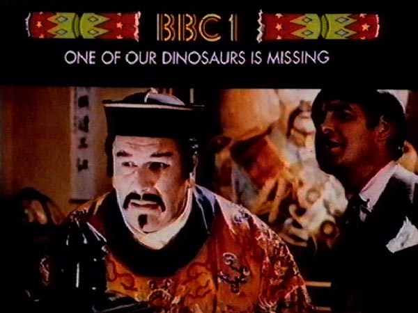
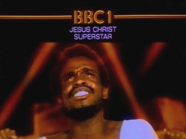
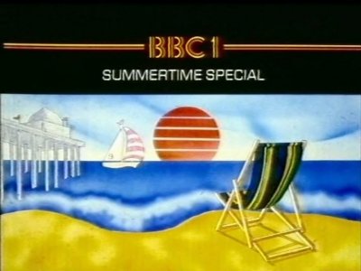
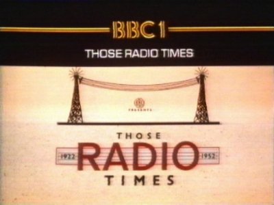
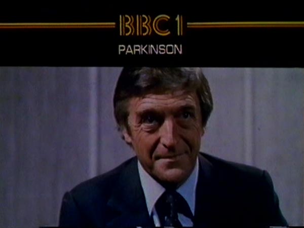
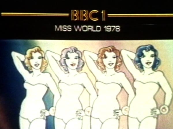
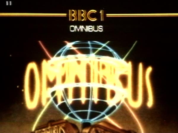
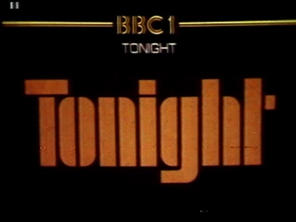
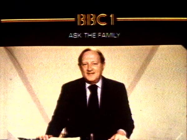
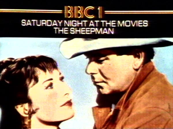
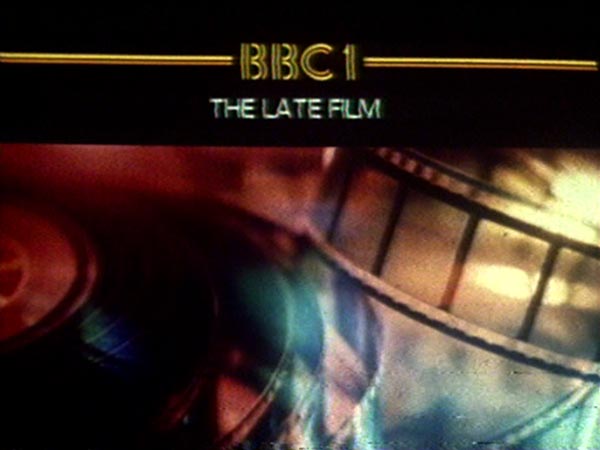
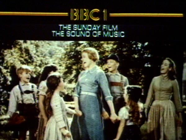
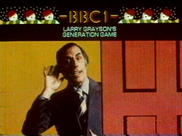
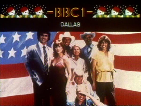
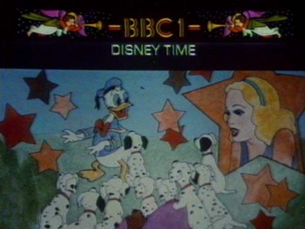
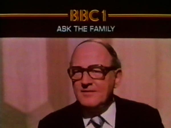
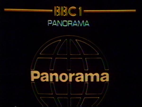
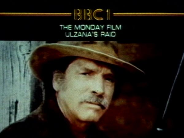
Across The Years ~ BBC 1 show saying goodbye to 1981 and hello to 1982.Bearheart of the Great Northwest ~ Film starring Denver Pyle (Dukes of Hazzard)The World Figure Skating Championships ~ World Figure Skating Championships slideCup Final Grandstand ~ Cup Final Grandstand. FA Cup Final 1981 won by Tottenham after a replay.Disney Time ~ Holding slide for Disney Time.Near and Far Follows Shortly ~ Holding slide for Schools programme Near and Far.One of Our Dinosaurs Is Missing ~ Christmas holding slide for this Disney movieJesus Christ Superstar ~ Holding slide for Jesus Christ Superstar, the movie based on the musical by Andrew Lloyd-Webber and Tim Rice.Summertime Special ~ Holding slide for Summertime Special.Those Radio Times ~ Holding slide for Those Radio Times.Parkinson ~ Holding slide for Parkinson.Miss World 1978 ~ Holding slide for Miss World 1978, won by Miss Argentina, Silvana Suárez.Omnibus ~ Holding slideTonight ~ Holding slideAsk The Family ~ Holding SlideSaturday Night At The Movies The Sheepman ~ Holding slideThe Late Film ~ Holding slideThe Sunday Film The Sound Of Music ~ Holding slideLarry Grayson’s Generation Game ~ Holding slideDallas ~ Holding slideDisney Time ~ Holding slideAsk The Family ~ Holding slidePanorama ~ Holding slideThe Monday Film Ulzana’s Raid ~ Holding slide
BBC2 Holding Slides
A selection of holding slides used to promote BBC 2 programmes; the following are from 1980.
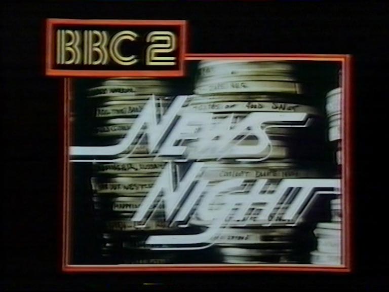
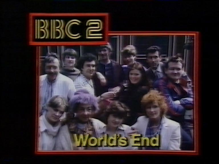
News Night ~ A BBC 1 slide for what’s on 2.World’s End ~ BBC 1 informing it’s viewers what is on 2.
How did they make the BBC1 “mirror ball” ident/symbol?
For countless aficionados, BBC 1’s iconic mirror globe serves as the quintessential emblem of the channel’s identity. Conceived and crafted by Murray Andrew in 1969, this captivating visual made its screen debut on November 15th of the same year. But what is the story behind the creation and on-screen presentation of this enduring symbol, as well as the accompanying timekeeping graphics?
The iconic globe was a compact mechanical marvel, roughly the dimensions of a shoebox. Illuminated from within by a 10V festoon bulb positioned at its apex, the globe achieved its reflective allure through a concave mirror situated behind it. The channel identifier, a backlit transparency, was designed for easy interchangeability. While most mechanical idents like clocks were typically lit by the presentation camera’s lamp, such an approach would have distorted the globe’s mirror reflection. Hence, an internal light source became imperative. Separate controls at the rear of the device allowed for adjustments to both the globe’s illumination and the ident’s backlighting.
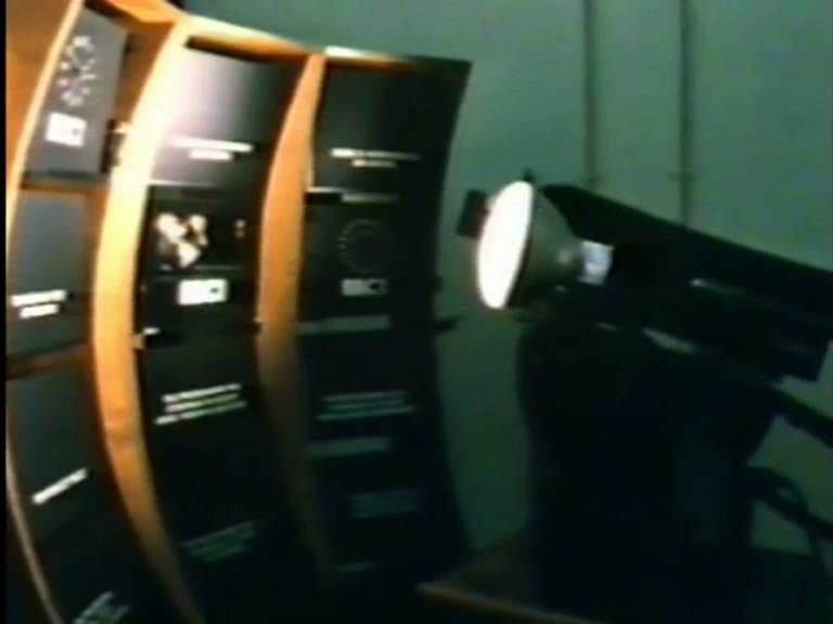
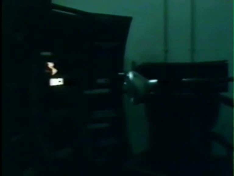
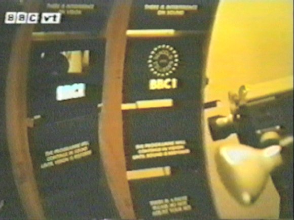
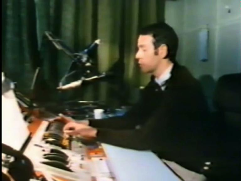
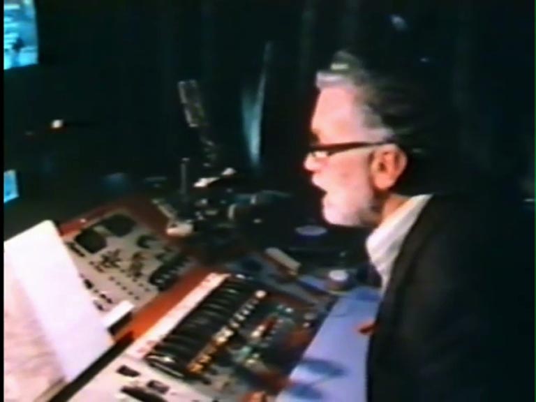
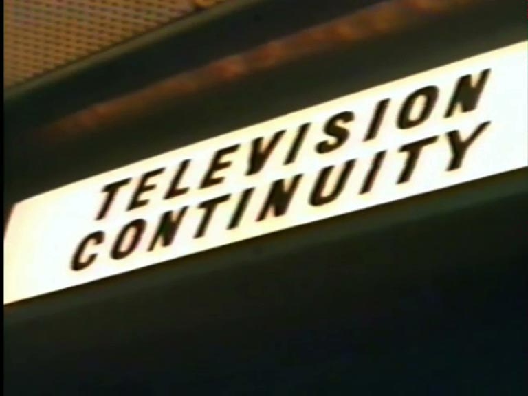
BBC1 Globe ~ The 1974 version of the globeBBC1 Symbol ~ Another view of the 1974 globeNoddy ~ According to surviving staff and internal BBC paperwork, the camera system for the 1970s BBC globe and adjacent ident symbols was called Noddy. It consisted of a black-and-white robotic camera which could pan or tilt (nod) across a display of twelve stacked ident symbols, clocks and fault captions. In the photo, the mirror globe and the Schools And Colleges dots are clearly visible. At the touch of a button, the announcer could point the camera to any one of the displays. The colour for each ident was added electronically further down the signal path, so it would have been very easy to play around with different colours (imagine a globe with a shocking pink land mass!) By 1982, the globe remained the sole mechanical symbol. BBC1’s globe is now rumoured to have pride of place in the office of the Head of Presentation.Noddy ~ Another view of the Noddy camera system in actionNoddy ~ Another view of the Noddy camera system in action. The ‘BBC vt’ logo originates from one of the videotape department’s infamous Christmas party tapes.Continuity announcerContinuity announcer‘Television Continuity’ sign
The globe’s geographical features were clear areas, outlined by black metallic paint symbolising the oceans. Due to heat from the internal bulb, the paint often peeled, necessitating frequent touch-ups to keep the continents accurately shaped. Contrary to popular belief, the numerous tiny ‘islands’ on the mirror globe were intentional design elements, not the result of flaking paint or accumulated dust.
Murray Andrew, the creative mind behind the mirror globe, experimented with several prototypes, including variations that featured raised continents and a visible South Pole.