ITV Thames Television Ident / Continuity
New, it's not
Quality: HQ
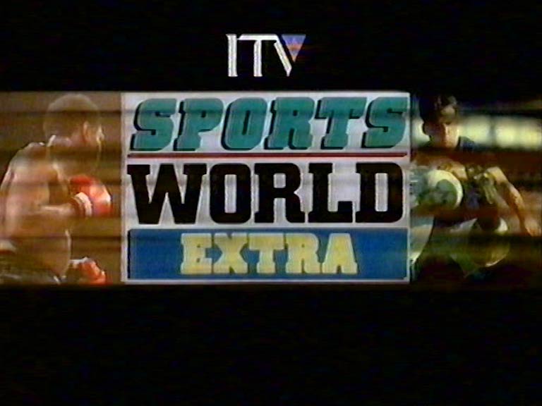
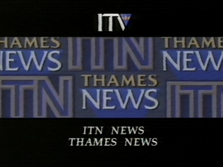
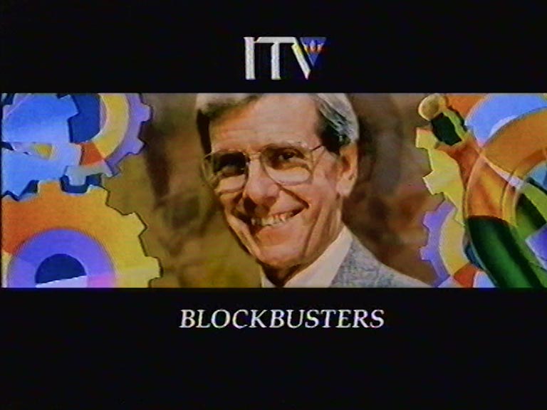
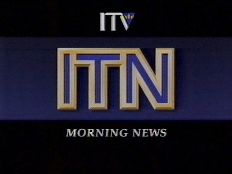
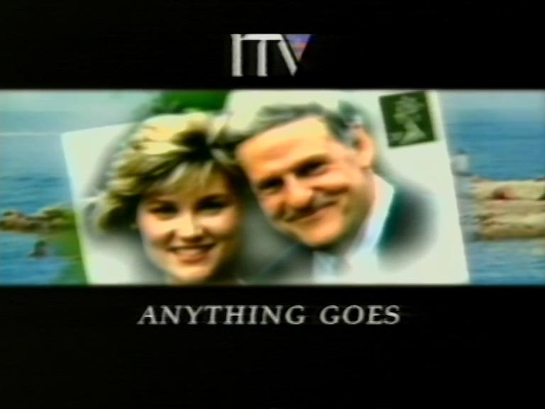
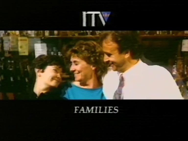
In the summer of 1989, Thames celebrated its 21st anniversary by unveiling a fresh logo and ident. Around this time, the ITV Network Centre embarked on a mission to create a unified corporate identity for ITV. This initiative led to the design of a new ITV logo and a series of generic idents that showcased themes like drama, news, sport, and dance. Each regional company’s logo was integrated at the animation’s top and seamlessly blended into the ‘V’ of ITV at the finale. As a result, Thames TV adopted a sleek, minimalistic London skyline logo. The creative minds behind these idents were English Markell Pockett, with David Dundas crafting the memorable ITV theme, which also doubled as an ITV song.
New, it's not
Quality: HQ
New, it's not
Quality: HQ
New, it's not
Quality: HQ
New, it's not
Quality: HQ
New, it's not
Quality: HQ
New, it's not
Quality: HQ
New, it's not
Quality: HQ
New, it's not
Quality: HQ
In September 1990 Thames gave its logo a refresh.
New, it's not
Quality: HQ
New, it's not
Quality: HQ
New, it's not
Quality: HQ
New, it's not
Quality: HQ
New, it's not
Quality: HQ
During this time, Thames mostly discontinued daytime In-Vision Continuity, retaining it only for overnight broadcasts. The practice was completely phased out by April 1991.
New, it's not
Quality: HQ
New, it's not
Quality: HQ
New, it's not
Quality: HQ
New, it's not
Quality: HQ
New, it's not
Quality: HQ
New, it's not
Quality: HQ
New, it's not
Quality: ST
New, it's not
Quality: ST
New, it's not
Quality: ST
New, it's not
Quality: ST
New, it's not
Quality: ST
New, it's not
Quality: ST
New, it's not
Quality: HQ
New, it's not
Quality: HQ
New, it's not
Quality: HQ
New, it's not
Quality: HQ
New, it's not
Quality: HQ
New, it's not
Quality: HQ
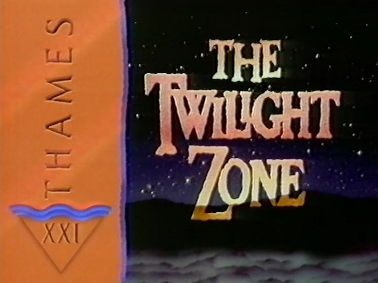
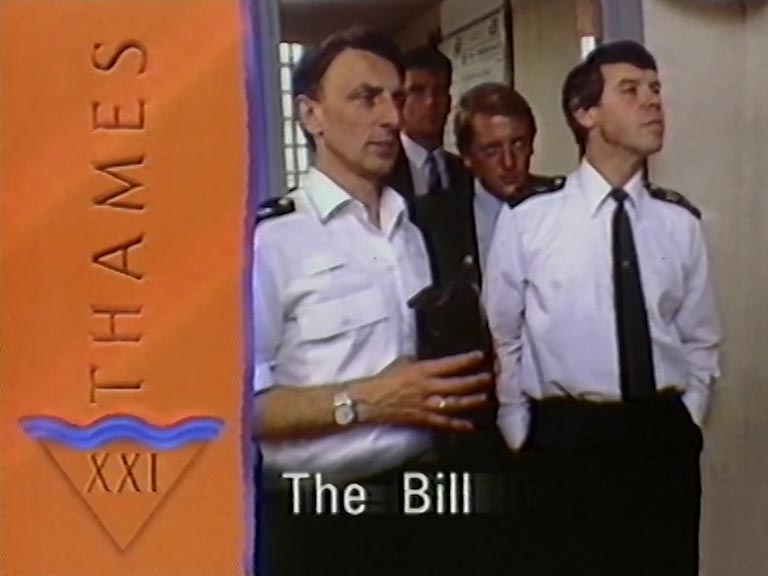
From 4th September 1989:
New, it's not
Quality: HQ
New, it's not
Quality: HQ
New, it's not
Quality: ST
New, it's not
Quality: ST
New, it's not
Quality: ST