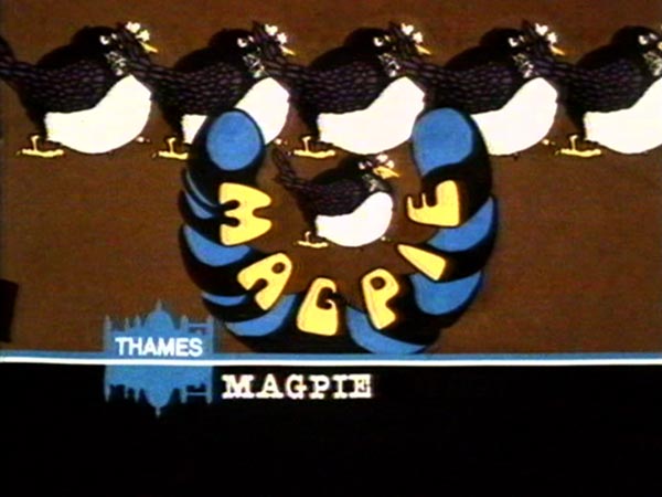
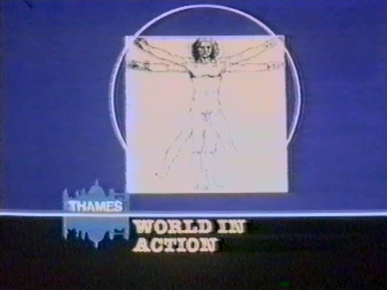
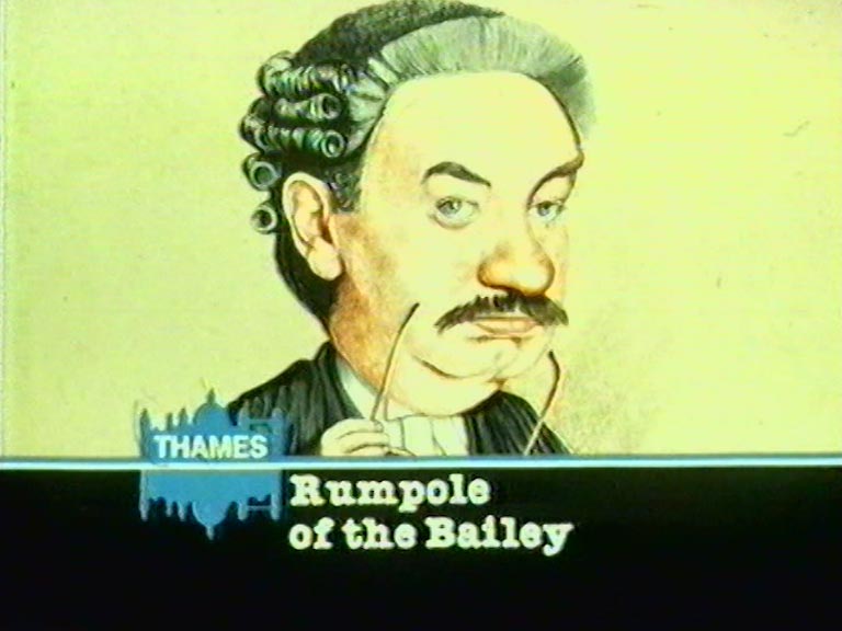
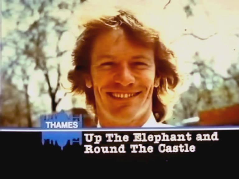
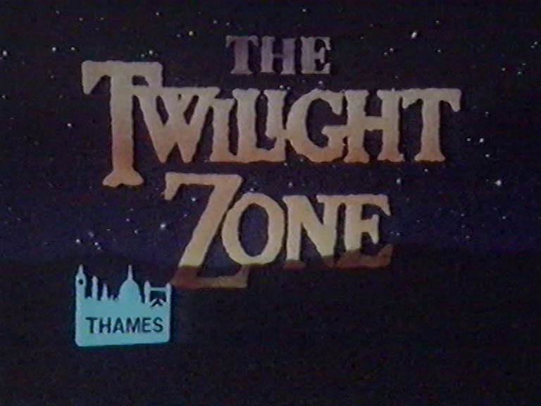
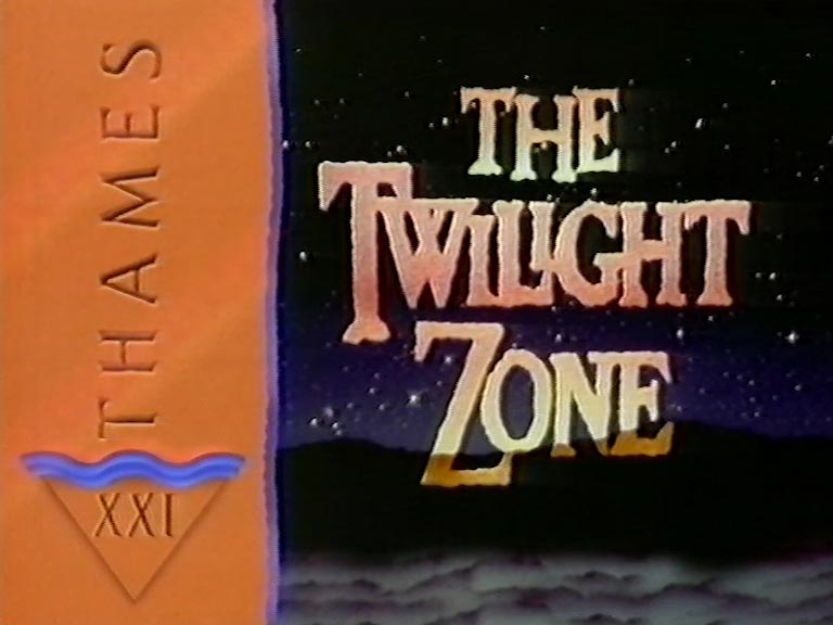
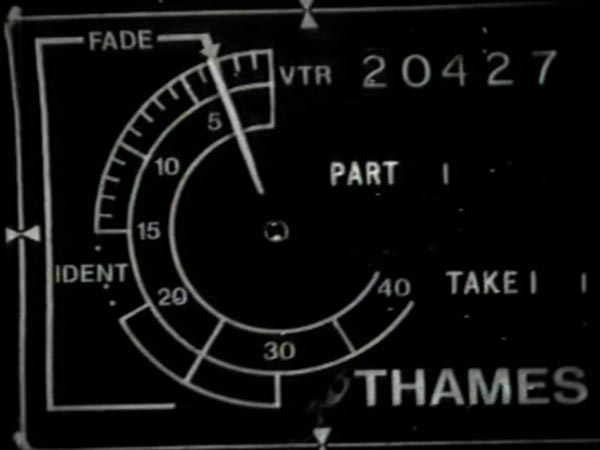
Thames Ident
New, it's not
Quality: HQ
New, it's not
Quality: HQ
Check out these fascinating clips which trace the evolution of the skyline and the choice of tune to accompany it, recovered from a Thames demo tape preserved on an antiquated video format. A test animation was dubbed with 22 separate tunes, of which we have nine.
A major influence on the developing ident tune appears to have been the chorus of Who Will Buy My Sweet Red Roses?, from Lionel Bart’s musical Oliver! Other influences include the traditional songs Oranges and Lemons and London Bridge is Falling Down. The last two clips feature embryonic versions of Hawkesworth’s tune.
New, it's not
Quality: ST
New, it's not
Quality: ST
New, it's not
Quality: ST
New, it's not
Quality: ST
New, it's not
Quality: ST
New, it's not
Quality: ST
New, it's not
Quality: ST
New, it's not
Quality: ST
New, it's not
Quality: ST
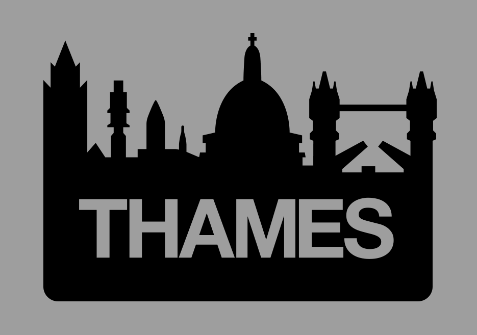
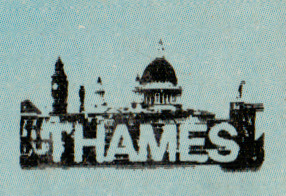
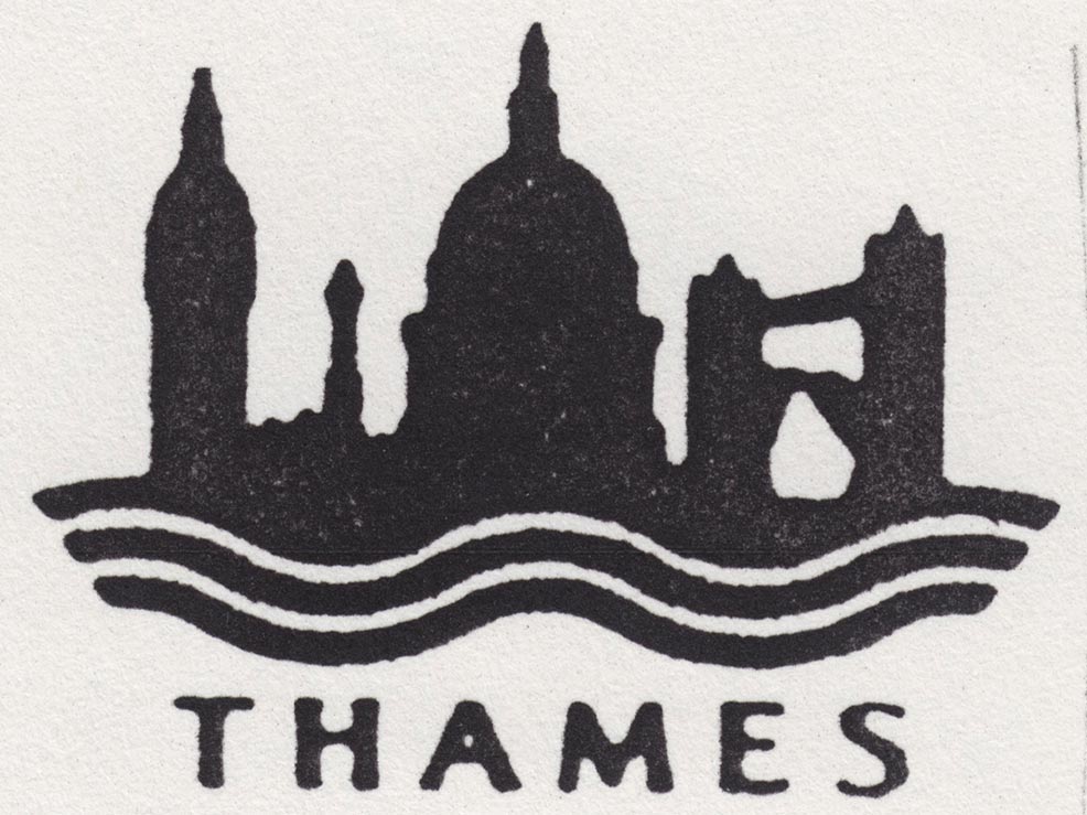
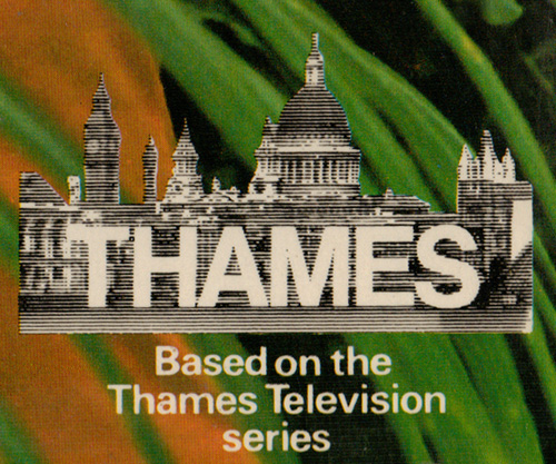
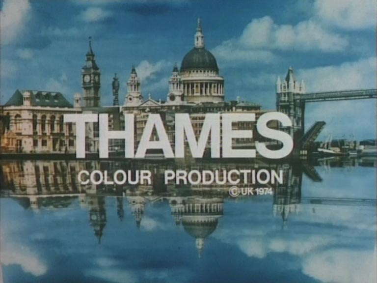
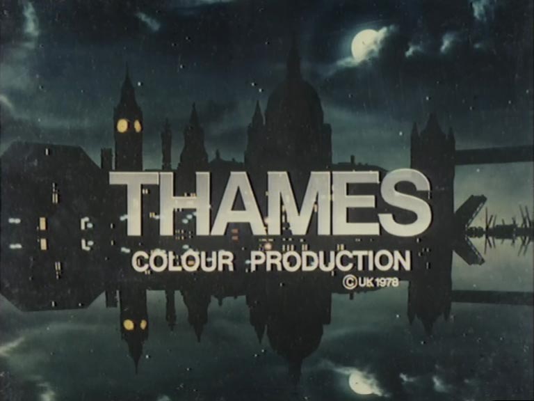
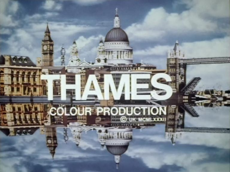
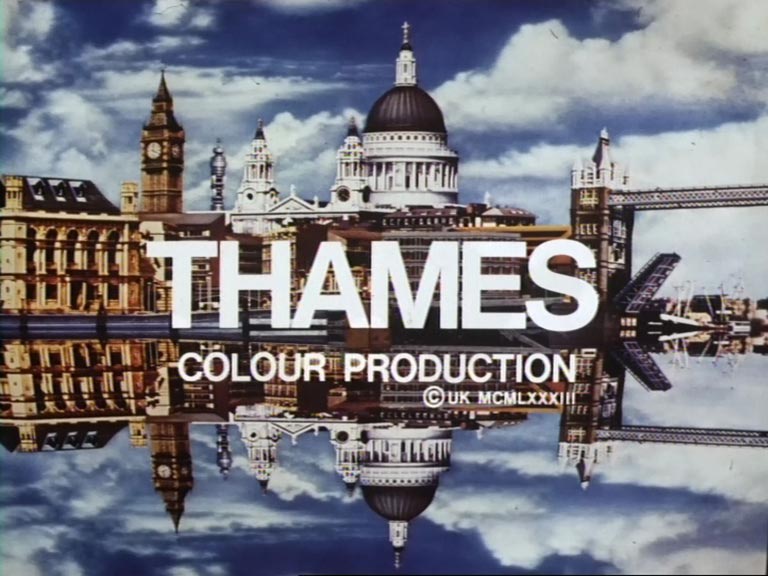
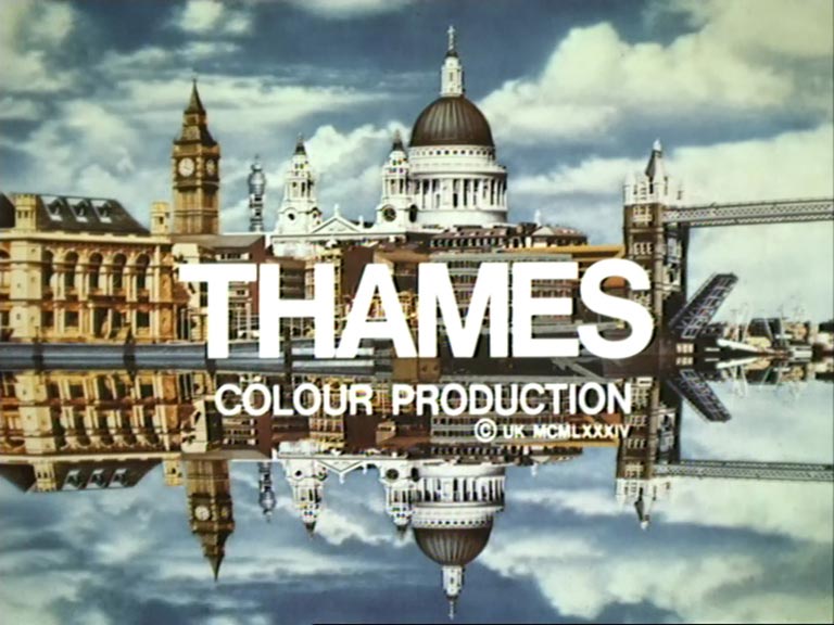
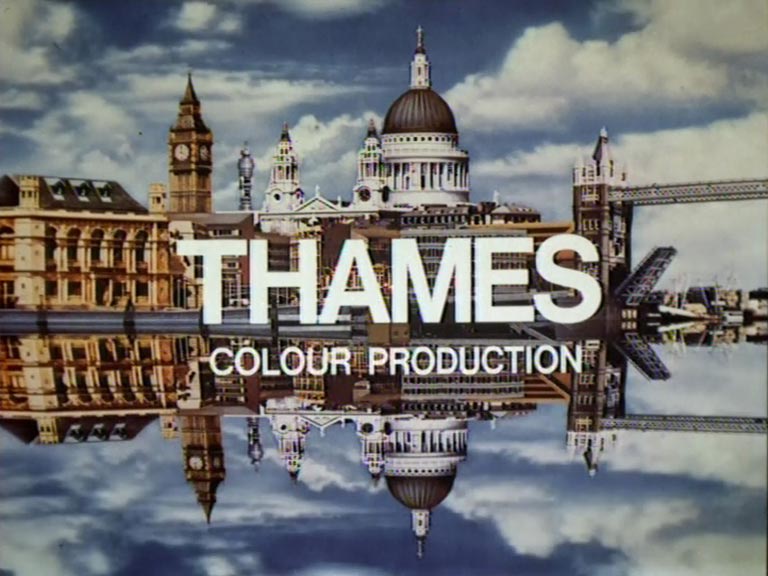
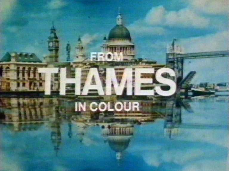
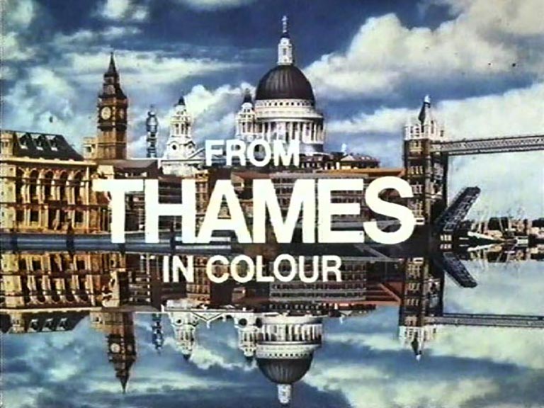
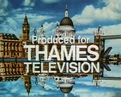
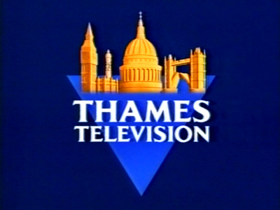
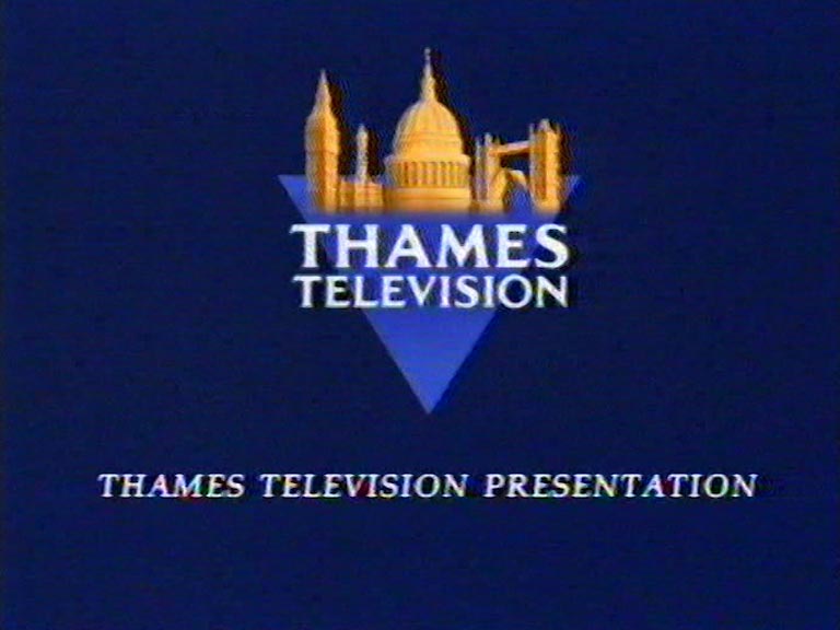
In 1969, the renowned design agency Minale Tattersfield crafted a distinctive skyline that has since become iconic. This design prominently showcases the majestic dome and towers of St. Paul’s Cathedral at its centre. To its right, one can spot the Tower Bridge, while Big Ben and the BT Tower (previously known as the GPO Tower) grace the left side. For those unfamiliar with London’s architecture, some buildings might seem like peculiar choices. Behind the ‘THAMES’ legend, one can discern the Embankment at Blackfriars. It’s believed that Tattersfield captured this perspective from the Upper Ground warehouses’ location, which later became the site for LWT’s South Bank Tower in the early 1970s.
The skyline also includes a 1960s office block, characterised by its unique wedge-shaped roof, nestled beneath both the GPO Tower and Big Ben. However, these offices located on Queen Victoria Street were torn down in May 2000 and are absent in contemporary views of the skyline. Contrary to some assumptions, the grand structure on the extreme left is not the County Hall but rather the old City of London school building near Blackfriars Bridge.
New, it's not
Quality: HQ
New, it's not
Quality: HQ
New, it's not
Quality: HQ
New, it's not
Quality: HQ
New, it's not
Quality: HQ
New, it's not
Quality: HQ
New, it's not
Quality: HQ
New, it's not
Quality: HQ
New, it's not
Quality: HQ
New, it's not
Quality: HQ
New, it's not
Quality: ST
New, it's not
Quality: ST
New, it's not
Quality: HQ
New, it's not
Quality: ST
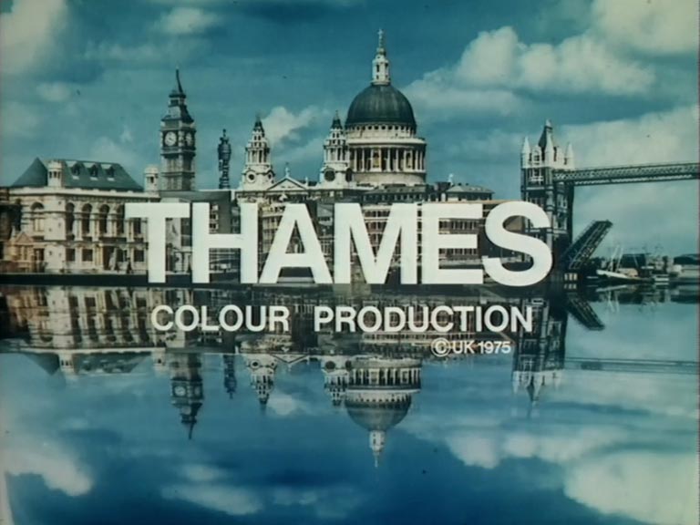
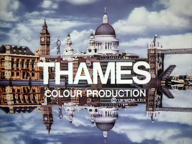
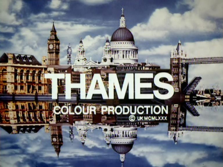
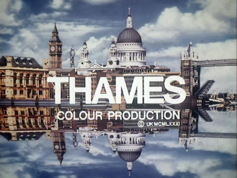
In 1976, Thames introduced a new coloured version of its ident. A decade later, in 1986, they revamped the ident once more, transitioning to a digital format.
New, it's not
Quality: ST
New, it's not
Quality: HQ
New, it's not
Quality: ST
New, it's not
Quality: HQ
New, it's not
Quality: HQ
New, it's not
Quality: HQ
New, it's not
Quality: ST
New, it's not
Quality: HQ
New, it's not
Quality: ST
New, it's not
Quality: HQ
New, it's not
Quality: ST
New, it's not
Quality: ST
New, it's not
Quality: HQ
New, it's not
Quality: ST
New, it's not
Quality: HQ
New, it's not
Quality: HQ
New, it's not
Quality: HQ
New, it's not
Quality: HQ
New, it's not
Quality: HQ
New, it's not
Quality: HQ
New, it's not
Quality: HQ
New, it's not
Quality: ST
New, it's not
Quality: ST
New, it's not
Quality: HQ
New, it's not
Quality: HQ
New, it's not
Quality: ST
New, it's not
Quality: HQ
New, it's not
Quality: HQ
New, it's not
Quality: ST
New, it's not
Quality: HQ
New, it's not
Quality: HQ
New, it's not
Quality: HQ
New, it's not
Quality: ST
New, it's not
Quality: ST
New, it's not
Quality: ST
New, it's not
Quality: HQ
New, it's not
Quality: HQ
New, it's not
Quality: HQ
New, it's not
Quality: HQ
New, it's not
Quality: HQ
New, it's not
Quality: ST
New, it's not
Quality: ST
New, it's not
Quality: HQ
New, it's not
Quality: HQ
New, it's not
Quality: ST
New, it's not
Quality: ST
New, it's not
Quality: HQ
New, it's not
Quality: ST
New, it's not
Quality: HQ
New, it's not
Quality: HQ
New, it's not
Quality: ST
New, it's not
Quality: HQ
New, it's not
Quality: HQ
New, it's not
Quality: HQ
New, it's not
Quality: HQ
New, it's not
Quality: HQ
New, it's not
Quality: HQ
New, it's not
Quality: ST
New, it's not
Quality: ST
New, it's not
Quality: ST
New, it's not
Quality: ST
New, it's not
Quality: ST
New, it's not
Quality: ST
New, it's not
Quality: ST
New, it's not
Quality: ST
New, it's not
Quality: HQ
New, it's not
Quality: HQ
New, it's not
Quality: HQ
New, it's not
Quality: HQ
New, it's not
Quality: HQ
New, it's not
Quality: ST
New, it's not
Quality: LQ
New, it's not
Quality: ST
New, it's not
Quality: ST
New, it's not
Quality: ST
New, it's not
Quality: HQ
New, it's not
Quality: ST
New, it's not
Quality: ST
New, it's not
Quality: HQ
New, it's not
Quality: HQ
New, it's not
Quality: ST
New, it's not
Quality: HQ
New, it's not
Quality: HQ
New, it's not
Quality: HQ
By June 1985 a new Thames backdrop is introduced to the presentation studio.
New, it's not
Quality: HQ
New, it's not
Quality: HQ
New, it's not
Quality: HQ
New, it's not
Quality: HQ
New, it's not
Quality: ST
New, it's not
Quality: HQ
New, it's not
Quality: HQ
New, it's not
Quality: HQ
New, it's not
Quality: HQ
New, it's not
Quality: HQ
New, it's not
Quality: HQ
New, it's not
Quality: HQ
New, it's not
Quality: HQ
New, it's not
Quality: HQ
New, it's not
Quality: HQ
New, it's not
Quality: HQ
New, it's not
Quality: HQ
New, it's not
Quality: HQ
New, it's not
Quality: ST
New, it's not
Quality: HQ
New, it's not
Quality: ST
New, it's not
Quality: ST
New, it's not
Quality: HQ
New, it's not
Quality: HQ
New, it's not
Quality: HQ
New, it's not
Quality: HQ
New, it's not
Quality: ST
New, it's not
Quality: HQ
New, it's not
Quality: HQ
New, it's not
Quality: ST
New, it's not
Quality: ST
New, it's not
Quality: ST
New, it's not
Quality: ST
New, it's not
Quality: ST
New, it's not
Quality: HQ
New, it's not
Quality: ST
New, it's not
Quality: ST
New, it's not
Quality: HQ
New, it's not
Quality: LQ
New, it's not
Quality: ST
New, it's not
Quality: ST
New, it's not
Quality: ST
New, it's not
Quality: LQ
New, it's not
Quality: ST
New, it's not
Quality: ST
New, it's not
Quality: HQ
New, it's not
Quality: ST
New, it's not
Quality: ST
New, it's not
Quality: ST
New, it's not
Quality: ST
New, it's not
Quality: ST
New, it's not
Quality: ST
New, it's not
Quality: ST
New, it's not
Quality: HQ
New, it's not
Quality: ST
New, it's not
Quality: ST
New, it's not
Quality: HQ
New, it's not
Quality: HQ
New, it's not
Quality: ST
New, it's not
Quality: ST
New, it's not
Quality: ST
New, it's not
Quality: ST
New, it's not
Quality: ST
New, it's not
Quality: ST
New, it's not
Quality: ST
New, it's not
Quality: ST
New, it's not
Quality: ST
New, it's not
Quality: HQ
New, it's not
Quality: HQ
New, it's not
Quality: HQ
New, it's not
Quality: ST
New, it's not
Quality: ST
New, it's not
Quality: ST
New, it's not
Quality: ST
New, it's not
Quality: HQ
New, it's not
Quality: ST
New, it's not
Quality: ST
New, it's not
Quality: ST
New, it's not
Quality: ST
New, it's not
Quality: ST
New, it's not
Quality: ST
New, it's not
Quality: ST
New, it's not
Quality: ST
New, it's not
Quality: HQ
New, it's not
Quality: HQ
New, it's not
Quality: HQ
Creating a trailer is an art form in itself, and broadcasters often employ whole departments whose sole responsibility is to plan, assemble and produce them. The best programme and film trailers usually consist of a well-judged selection of funny or startling clips, cut to dramatic or catchy music and linked with arresting or quirky voice-overs. But it was not always the case. During the 1970s and early 1980s, it was possible for trailers to comprise of just of one thirty-second clip, with a caption superimposed on the end, or perhaps a line of narration delivered live by the duty continuity announcer. No matter what the era, it seems fair to observe that the sophistication of any trailer grows in proportion to the availability of time and budget, for editing and for graphics. With Thames TV broadcasting for twenty-four years, many different styles of trailer can be detected among their on-air promotions. Often they relied on the vocal talents of Bruce Hammal to deliver the puncy narration, always ending in a well-emphasised channel identification, “…ON THAMES!”
New, it's not
Quality: ST
New, it's not
Quality: HQ
New, it's not
Quality: ST
New, it's not
Quality: HQ
New, it's not
Quality: HQ
New, it's not
Quality: HQ
New, it's not
Quality: ST
New, it's not
Quality: HQ
New, it's not
Quality: HQ
New, it's not
Quality: ST
New, it's not
Quality: HQ
New, it's not
Quality: HQ
New, it's not
Quality: HQ
New, it's not
Quality: ST
New, it's not
Quality: HQ
New, it's not
Quality: HQ
New, it's not
Quality: HQ
New, it's not
Quality: HQ
New, it's not
Quality: HQ
New, it's not
Quality: HQ
New, it's not
Quality: HQ
New, it's not
Quality: HQ
New, it's not
Quality: HQ
New, it's not
Quality: HQ
New, it's not
Quality: HQ
New, it's not
Quality: HQ
New, it's not
Quality: HQ
New, it's not
Quality: HQ
New, it's not
Quality: HQ
New, it's not
Quality: ST
New, it's not
Quality: HQ
New, it's not
Quality: HQ
New, it's not
Quality: HQ
New, it's not
Quality: HQ
New, it's not
Quality: HQ
New, it's not
Quality: HQ
New, it's not
Quality: HQ
New, it's not
Quality: HQ
New, it's not
Quality: HQ
New, it's not
Quality: HQ
New, it's not
Quality: ST
New, it's not
Quality: ST
New, it's not
Quality: ST
New, it's not
Quality: ST
New, it's not
Quality: HQ
New, it's not
Quality: HQ
New, it's not
Quality: HQ
New, it's not
Quality: ST
New, it's not
Quality: ST
New, it's not
Quality: HQ
New, it's not
Quality: ST
New, it's not
Quality: ST
New, it's not
Quality: ST
New, it's not
Quality: ST
New, it's not
Quality: HQ
New, it's not
Quality: ST
New, it's not
Quality: ST
New, it's not
Quality: HQ
New, it's not
Quality: HQ
New, it's not
Quality: HQ
New, it's not
Quality: HQ
New, it's not
Quality: HQ
New, it's not
Quality: HQ
New, it's not
Quality: HQ
New, it's not
Quality: HQ
New, it's not
Quality: HQ
The various holding slides and captions that used to pop up just after a show had ended, leading into an ad break with the name of the programme coming next. These examples of “break teases” are listed in date order,
New, it's not
Quality: HQ
New, it's not
Quality: ST
New, it's not
Quality: ST
New, it's not
Quality: ST
By 1980 a new style of holding slide was introduced
New, it's not
Quality: HQ
New, it's not
Quality: ST
New, it's not
Quality: ST
New, it's not
Quality: HQ
New, it's not
Quality: HQ
Another style of holding slide introduced in 1982
New, it's not
Quality: HQ
New, it's not
Quality: HQ
New, it's not
Quality: HQ
New, it's not
Quality: ST
New, it's not
Quality: ST
New, it's not
Quality: HQ
New, it's not
Quality: HQ
New, it's not
Quality: HQ
New, it's not
Quality: HQ
New, it's not
Quality: ST
New, it's not
Quality: ST
New, it's not
Quality: ST
New, it's not
Quality: ST
New, it's not
Quality: ST
New, it's not
Quality: ST
New, it's not
Quality: ST
New, it's not
Quality: ST
New, it's not
Quality: HQ
New, it's not
Quality: ST
New, it's not
Quality: ST
New, it's not
Quality: ST
New, it's not
Quality: ST
New, it's not
Quality: ST
New, it's not
Quality: ST
New, it's not
Quality: ST
New, it's not
Quality: ST
New, it's not
Quality: HQ
In 1988 a new style appeared
New, it's not
Quality: HQ
New, it's not
Quality: HQ
New, it's not
Quality: HQ
New, it's not
Quality: HQ
New, it's not
Quality: HQ
New, it's not
Quality: HQ
New, it's not
Quality: ST
In the summer of 1984 a major strike was called, this time, over Thames’s management unilaterally issuing new rostering schedules (overtime payments for transmission staff), and the use of new cameras and editing equipment. There were no internal discussions of the potential savings that could be derived from new shift patterns, but there was a strong sense that union controls had to be removed before the company embarked on increasing its operations. The technicians walked out, but the station was off the air for just one day as management and administration staff took over their roles. On Monday 27 August, ATTC technicians walked out again over the new shift patterns; the strike ended on 3 September 1984, at 1pm after the union agreed to rostering according to need, while the management dropped plans for ending six day working fortnights. Bryan Cowgill said: “The need for sensible change in the way we conduct our operations has been at the heart of this dispute. The outcome of a damaging and costly dispute has resulted in substantial progress towards a more realistic and effective way of working”.Over the following four weeks, further discussions took place about implementing the plans while introducing new technologies. On Wednesday 17 October, another strike was instigated, as talks failed to reach agreement. The union warned against a management-run service, as it would be a recipe for total network disturbance and a massive loss of programmes, but Thames claimed that it would be justified due to the strike being unofficial.[22] On Tuesday 23 October, a management-run service started operating; the company claimed the revised schedule was popular with the viewers. The strike finally ended on 3 November 1984, after 62 film editors agreed to the new conditions, while the ACTT agreed as well to start negotiations about the introductions of new technology. Additional episodes of network productions were screened to help clear the backlog, since no outside programmes were broadcast. Thames said: “We are delighted in the outcome of the dispute which we believe is in the best interests of everyone who works at Thames
New, it's not
Quality: ST
New, it's not
Quality: HQ
New, it's not
Quality: HQ
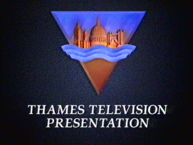
In the summer of 1989, Thames celebrated its 21st anniversary by unveiling a fresh logo and ident. Around this time, the ITV Network Centre embarked on a mission to create a unified corporate identity for ITV. This initiative led to the design of a new ITV logo and a series of generic idents that showcased themes like drama, news, sport, and dance. Each regional company’s logo was integrated at the animation’s top and seamlessly blended into the ‘V’ of ITV at the finale. As a result, Thames TV adopted a sleek, minimalistic London skyline logo. The creative minds behind these idents were English Markell Pockett, with David Dundas crafting the memorable ITV theme, which also doubled as an ITV song.
New, it's not
Quality: HQ
New, it's not
Quality: HQ
New, it's not
Quality: HQ
New, it's not
Quality: HQ
New, it's not
Quality: HQ
New, it's not
Quality: HQ
New, it's not
Quality: HQ
New, it's not
Quality: HQ
In September 1990 Thames gave its logo a refresh.
New, it's not
Quality: HQ
New, it's not
Quality: HQ
New, it's not
Quality: HQ
New, it's not
Quality: HQ
New, it's not
Quality: HQ
During this time, Thames mostly discontinued daytime In-Vision Continuity, retaining it only for overnight broadcasts. The practice was completely phased out by April 1991.
New, it's not
Quality: HQ
New, it's not
Quality: HQ
New, it's not
Quality: HQ
New, it's not
Quality: HQ
New, it's not
Quality: HQ
New, it's not
Quality: HQ
New, it's not
Quality: ST
New, it's not
Quality: ST
New, it's not
Quality: ST
New, it's not
Quality: ST
New, it's not
Quality: ST
New, it's not
Quality: ST
New, it's not
Quality: HQ
New, it's not
Quality: HQ
New, it's not
Quality: HQ
New, it's not
Quality: HQ
New, it's not
Quality: HQ
New, it's not
Quality: HQ
From 4th September 1989:
New, it's not
Quality: HQ
New, it's not
Quality: HQ
New, it's not
Quality: ST
New, it's not
Quality: ST
New, it's not
Quality: ST
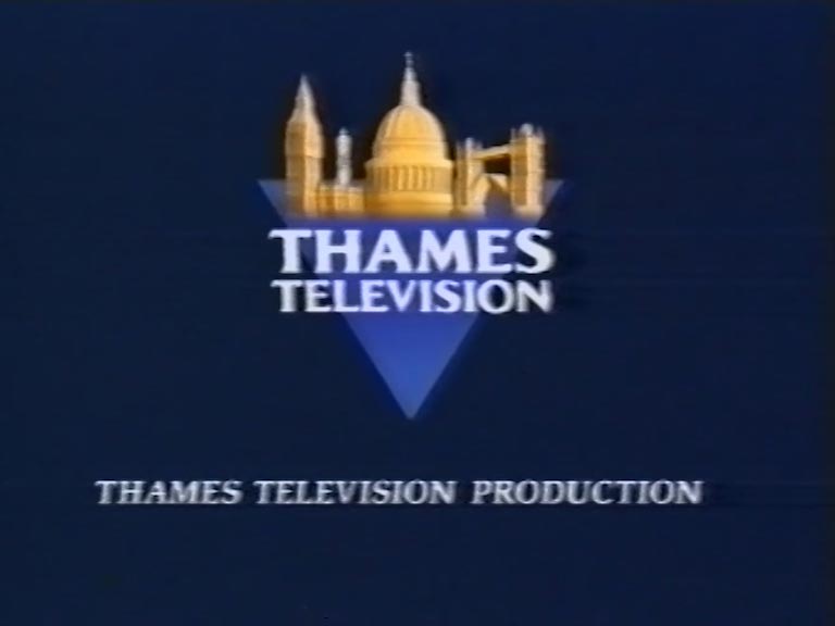
In September 1990 Thames introduced a updated logo. The logo is so stately with its models of Big Ben, St Paul’s and Tower Bridge, whirling past each other to settle on a blue triangle, there is almost a hint of defiance, that the future holds only good things. A new ident was created using solely this logo, however it was only used before local programmes. With the loss of the London weekday franchise to Carlton in 1991, Knowing the end was nigh, Thames abandoned the generic ITV look and switched to using the local ident full time in November 1991.
New, it's not
Quality: HQ
New, it's not
Quality: HQ
New, it's not
Quality: HQ
New, it's not
Quality: ST
New, it's not
Quality: ST
New, it's not
Quality: ST
New, it's not
Quality: HQ
New, it's not
Quality: HQ
New, it's not
Quality: HQ
New, it's not
Quality: HQ
New, it's not
Quality: ST
New, it's not
Quality: HQ
New, it's not
Quality: HQ
New, it's not
Quality: HQ
New, it's not
Quality: ST
New, it's not
Quality: HQ
New, it's not
Quality: ST
New, it's not
Quality: ST
New, it's not
Quality: ST
New, it's not
Quality: ST
New, it's not
Quality: ST
New, it's not
Quality: ST
New, it's not
Quality: ST
New, it's not
Quality: ST
New, it's not
Quality: HQ
New, it's not
Quality: HQ
New, it's not
Quality: ST
New, it's not
Quality: ST
New, it's not
Quality: ST
New, it's not
Quality: HQ
New, it's not
Quality: HQ
New, it's not
Quality: HQ
New, it's not
Quality: ST
New, it's not
Quality: ST
New, it's not
Quality: HQ
New, it's not
Quality: ST
New, it's not
Quality: ST
New, it's not
Quality: ST
New, it's not
Quality: ST
New, it's not
Quality: HQ
New, it's not
Quality: HQ
New, it's not
Quality: HQ
New, it's not
Quality: ST
New, it's not
Quality: ST
New, it's not
Quality: ST
New, it's not
Quality: HQ
New, it's not
Quality: ST
Further examples of Thames holding slides.
New, it's not
Quality: HQ
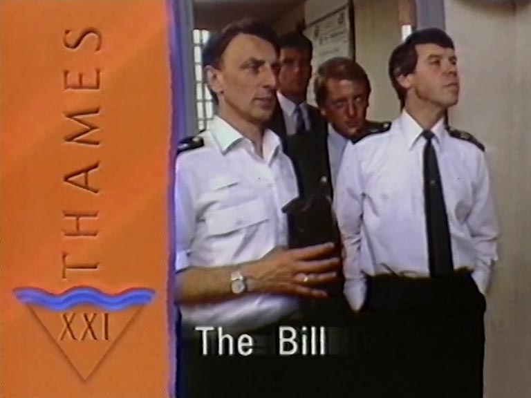
End boards are usually the final image to be seen on a TV show, explaining the name of the production company or copyright owner and sometimes also the year of production. In the modern television era, these graphics are animated, but the phrase ‘end board’ dates back to the ‘golden age’ of television with which TVARK is preoccupied, when they actually were small, flat pieces of card with artwork mounted on them, perhaps 3 x 4 inches in size and placed on a stand. To compliment our history of Thames idents, here is our collection of the company’s end boards from 1968 to 1992 as per original broadcast, along with end boards for shows repeated or reversioned up to the present day; we’re always on the lookout for more!
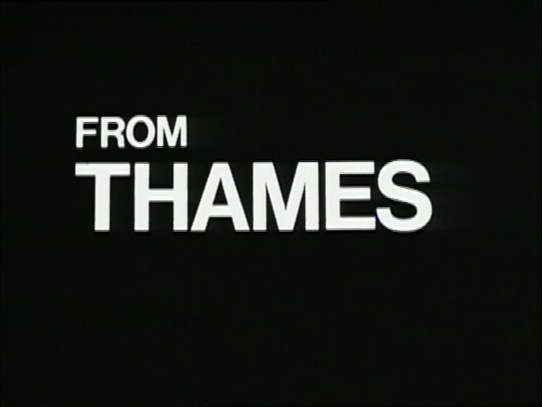
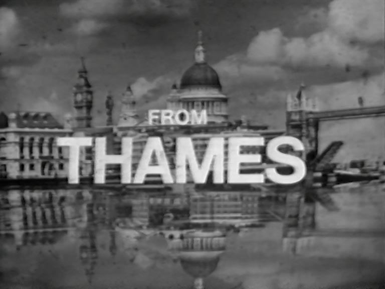
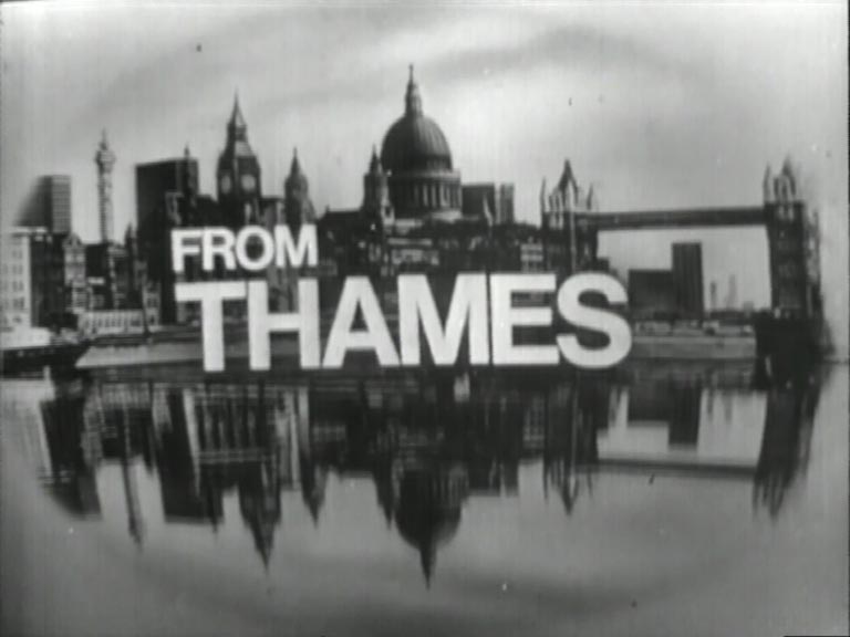
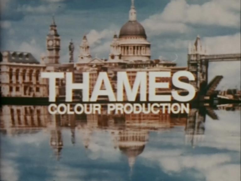
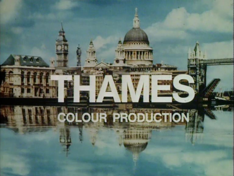
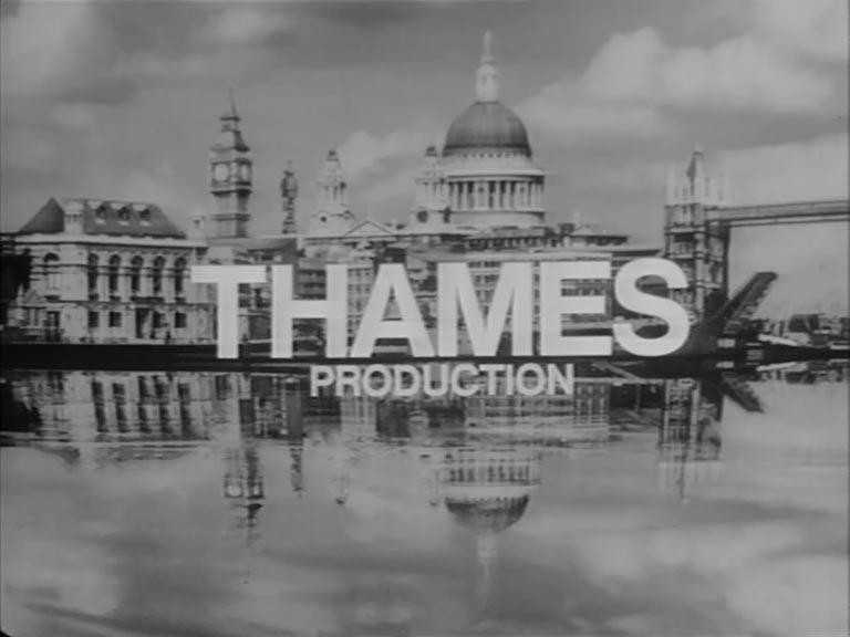
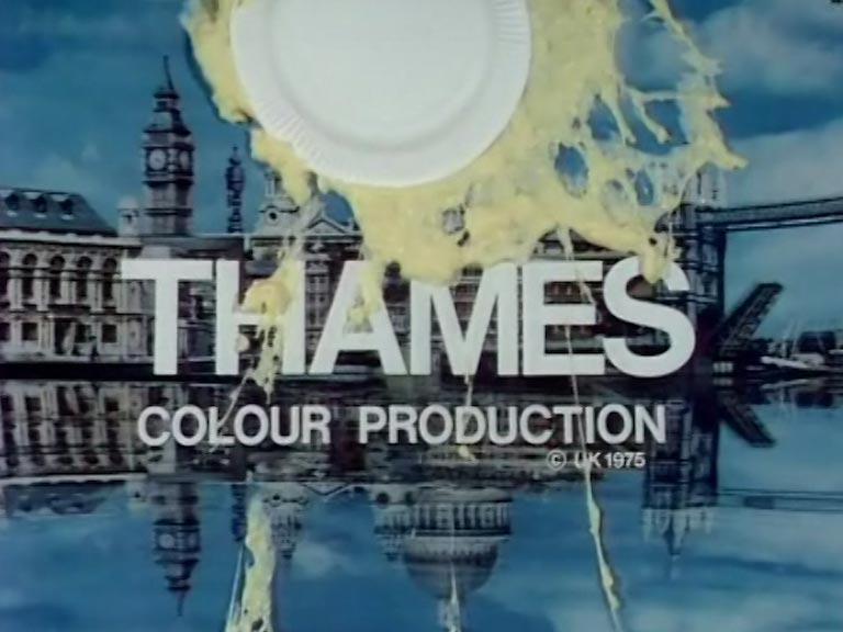
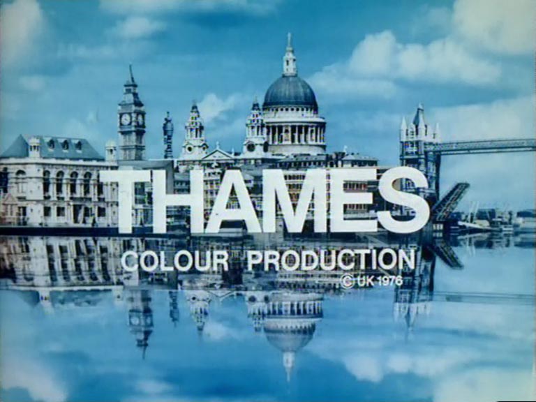
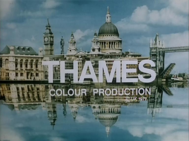
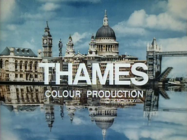


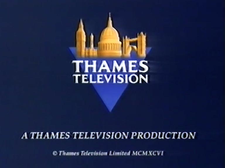
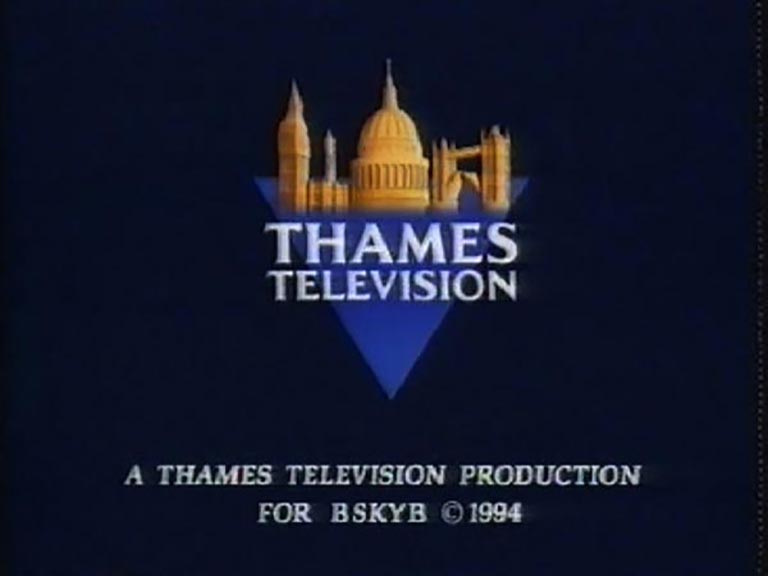
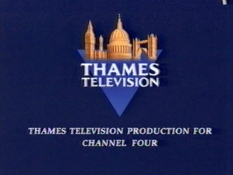
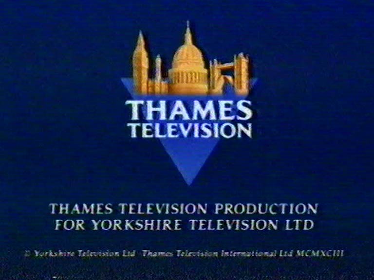
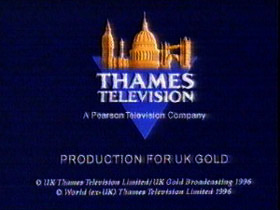
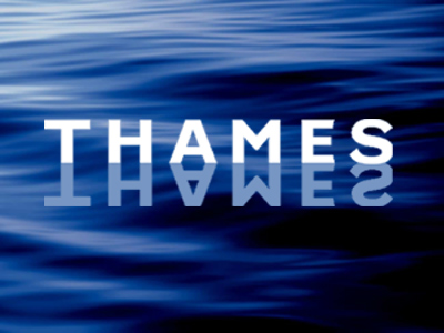
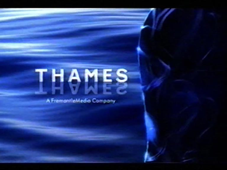
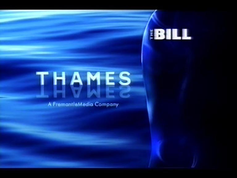
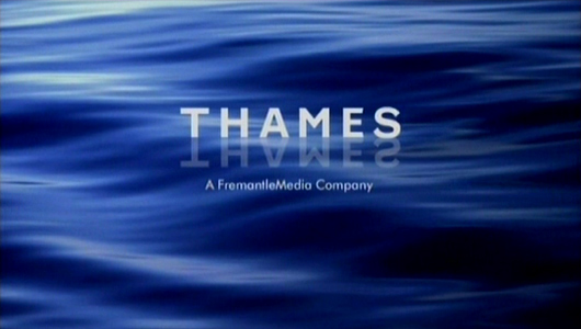
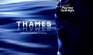
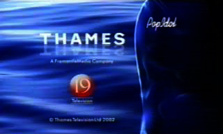
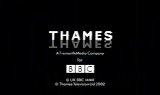
The earliest end boards simply stated “From Thames” or “Thames Colour Production”, but from the mid-1970s a copyright date was often given as well, sometimes in the form of Roman numerals. The last of the colour photographic skylines in the mid-1980s dropped the date again, since this was usually shown under the final name on the closing credit roller. After Thames lost its London weekday franchise in 1992, the company was taken over first by Pearson, and then Fremantle. Thames was a memorable brand and Pearson didn’t want people to be reminded of it, so the skyline idents and end-boards were usually removed from repeats or media re-issues of Thames programmes. New Thames programmes made in the Pearson era, such as The Bill or Heroes of Comedy, simply showed the Thames name in white lettering on black, with a stylised image of Tower Bridge placed above it. Repeats of old shows, such as 1973’s World at War, were given 1990s-style end-boards. When Fremantle bought Thames in 2001, they recognised the power of the brand name and were less insistent on replacing the skyline with their own logo, in which white paint spatters over a blue background. But they did update the Thames logo to show the letters floating over water. After which Thames merged with Talkback to form Talkback Thames, and further logos have been developed, many of which show the letters animating into their final position. There’s a chance that this page may be slightly more interesting than an episode of Looks Familiar.